


Hey, figured I'd start a thread for the community to discuss the new optimizer feature. If nothing else, I'll put my notes in this thread.
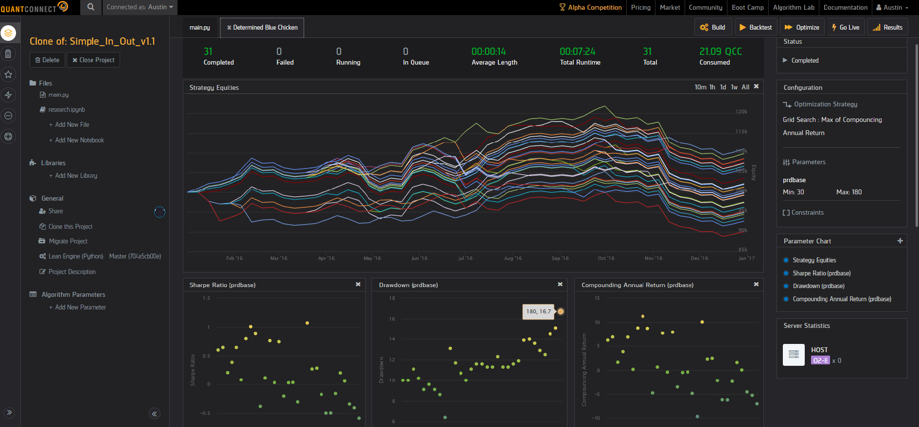
SCREENSHOTS:

USAGE TIP:
Looks like parameter optimization only supports `decimal` (the dropdown shows a disabled `integer` option so that's likely coming), so in the mean time make sure to cast to `int`
self.prdbase = int(self.GetParameter("prdbase"))

PRAISE:
- Showing individual backtests is great
- having min/max/step size is essential to optimizing (ha) speed over realistic optimization values and saving money on resources, so glad that's in from the beginning
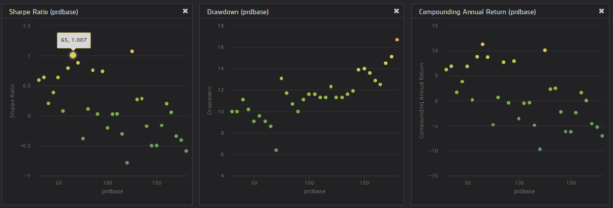
- charts with sharpe/dd/annual return vs optimized value are a must have, glad to see these in here too, it's also equally essential to see the optimization value when hovering over a datapoint (for example, my screenshot shows a prdbase value of 65 yielding a 1.007 sharpe)
SUGGESTIONS:
- strategy equity overview chart in it's current state, while pretty, is useless. Please add the same data point annotation that shows which parameter value is used to create a given colored equity line. I don't even think there's a legend explaining which colors correspond to which parameter value, though obviously one could grind with provided data to figure it out... but that's not the point. in it's current state, hovering shows a unique "shape", such as a hollow triangle.
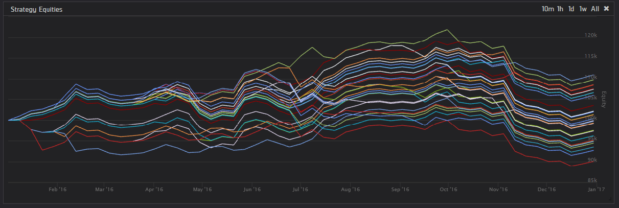
- Perhaps you may think of a better UX design, but I think this design choice would be EXTREMELY helpful: For all 4 displayed graphs, color the scatter point / equity curve for a given parameter value (e.g. baseprd = 65) across all graphs using the SAME color. to choose the colors, make it a gradient from two colors, let's pretend light blue to dark green for the sake of example (colors do not matter but distinguisable is the goal). Instead of making the color gradient vertical for sharpe/etc, make it horizontal, CORRESPONDING to the optimized value on the scale of min-value to min-value. In it's current form, it's mostly deviod of meaning apart from aestetics. Now this obviously means the Equity curve will not have a pretty gradient up and down, but a jumbling of these colors, but what this does is it allows a user to quicky distinguish "oh my best equity curve is light blue, that means it must be one of the minimum parameter values that is the best". This improves the at-a-glance UX, but equity curve data annotations is a must-have that furthers the functionality of this curve.

 I'm going to post this now and continue suggestions in the comments because if I accidentally hit backspace again while not :focus'd in this text-area and delete my whole post, I'm just not going to post at all


Austin
SUGGESTIONS CONTINUED:
As always, I love this work. My overarching review is positive, as is my impression of all the devs working hard to improve this platform! But there is always room for growth, and I wanted to start that conversation.
Hector Barrio
I suscribe to the pricing model suggestion as Austin says, adding that it can be the other way around, the optimizer may cannibalize fixed node subscriptions depending on your yearly CPU consumption. Fixed nodes should be able to get pooled into optimization to make them more attractive.
Karthik Kailash
I think maximum flexibility would be ideal. Expose the underlying backtest scheduling and dynamic scaling as an API. Then expose an open source optimization framework (maybe within LEAN), so people can implement an optimization as code just like backtests. This code can again be local or in your web IDE. This will greatly increase the proliferation of different optimization options beyond what is achievable through a point-and-click UI. For example the framework can expose places to plug in parameter generation, the optimization function (e.g. sharpe ratio, or something custom), even report generation. If the implementation is open-sourced, the community can contribute useful version of these things (much like how indicators can get added in LEAN today). This has the added benefit where possible more advanced optimization algos (e.g. beyond grid search) could be outsourced to existing libraries with robust implementations.
I also agree with the points above about a hybrid model where optimization/automated backtests and manual backtests can share the same resources, so they can run either on monthly pre-paid nodes or scale out to the shared node pool.
Jared Broad
Thanks for the feedback all, it's a quite different technology that powers the two node types but I appreciate the desire to want to reuse your existing subscriptions. We've come up with a "slider" concept where it'll use your initial nodes available and you can "slide" it up the scale to rope in more nodes on a per hour basis. This should give you the speed of the original nodes, and scaling of the new optimization nodes when you need it.
It'll take some time to implement with Christmas but hopefully, in the next 10 days, the wizard will reflect this new feature.
The material on this website is provided for informational purposes only and does not constitute an offer to sell, a solicitation to buy, or a recommendation or endorsement for any security or strategy, nor does it constitute an offer to provide investment advisory services by QuantConnect. In addition, the material offers no opinion with respect to the suitability of any security or specific investment. QuantConnect makes no guarantees as to the accuracy or completeness of the views expressed in the website. The views are subject to change, and may have become unreliable for various reasons, including changes in market conditions or economic circumstances. All investments involve risk, including loss of principal. You should consult with an investment professional before making any investment decisions.
Austin
"We've come up with a "slider" concept where it'll use your initial nodes available and you can "slide" it up the scale to rope in more nodes on a per hour basis. This should give you the speed of the original nodes, and scaling of the new optimization nodes when you need it."
That would be awesome, glad to hear this feature request is already in the works!
It reminded me of what I heard in this Ernie Chan video (23 minutes in), he mentions how if you pay for cloud computing and you think a test is likely to fail, there is a psycological barrier that makes it less likely for you to run failing tests. I'm glad that in the future, I'll have the ability to run tests on slower/unoptimized nodes for tests that I believe will fail, but still want to test a hypothesis. :)
Austin
Also, will Optimizer runs be queueable, like backtests are? I only have a Researcher seat so I don't currently have access to backtest queueing but would likely upgrade if it did.
I think there are several use cases, but my primary one would be for Walk-Forward analysis, in this example one could queue 5 optimizations at once and use the results to then queue 5 walk-forward backtests:
This would greatly help me avoid the pitfall Jared made at the end of the announcement thread - "PS: It may be tempting to use this to hyper tune the backtest but resist the urge! It is generally meaningless to look at a single backtest with this analysis tool."
Austin
The material on this website is provided for informational purposes only and does not constitute an offer to sell, a solicitation to buy, or a recommendation or endorsement for any security or strategy, nor does it constitute an offer to provide investment advisory services by QuantConnect. In addition, the material offers no opinion with respect to the suitability of any security or specific investment. QuantConnect makes no guarantees as to the accuracy or completeness of the views expressed in the website. The views are subject to change, and may have become unreliable for various reasons, including changes in market conditions or economic circumstances. All investments involve risk, including loss of principal. You should consult with an investment professional before making any investment decisions.
To unlock posting to the community forums please complete at least 30% of Boot Camp.
You can continue your Boot Camp training progress from the terminal. We hope to see you in the community soon!