Backtesting
Report
Key Statistics
The top of the backtest report displays statistics to summarize your algorithm's performance. The following table describes the key statistics in the report:
| Statistic | Description |
|---|---|
| Runtime Days | The number of days in the backtest or live trading period. |
| Turnover | The percentage of the algorithm's portfolio that was replaced in a given year. |
| CAGR | The annual percentage return that would be required to grow a portfolio from its starting value to its ending value. |
| Markets | The asset classes that the algorithm trades. |
| Trades per day | The total number of trades during the backtest divided by the number of days in the backtest. Trades per day is an approximation of the algorithm's trading frequency. |
| Drawdown | The largest peak to trough decline in an algorithm's equity curve. |
| Probabilistic SR | The probability that the estimated Sharpe ratio of an algorithm is greater than a benchmark. |
| Sharpe Ratio | A measure of the risk-adjusted return, developed by William Sharpe. |
| Information Ratio | The amount of excess return relative to the benchmark per unit of tracking error. |
| Strategy Capacity | The maximum amount of money an algorithm can trade before its performance degrades from market impact. Capacity is determined by the liquidity of the assets the algorithm trades and the size of positions it takes. |
Returns
The backtest report displays charts to show the algorithm's returns per trade, per day, per month, per year, and the cumulative returns over the backtest.
Returns per Trade
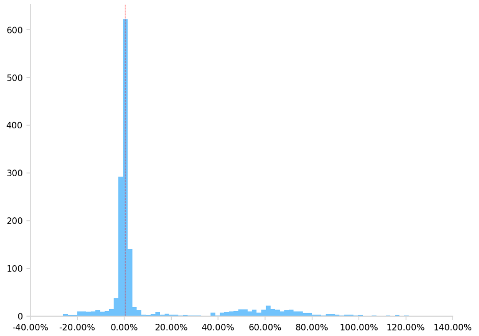
This chart displays a histogram that shows the distribution of returns per trade over the backtesting period.
Daily Returns
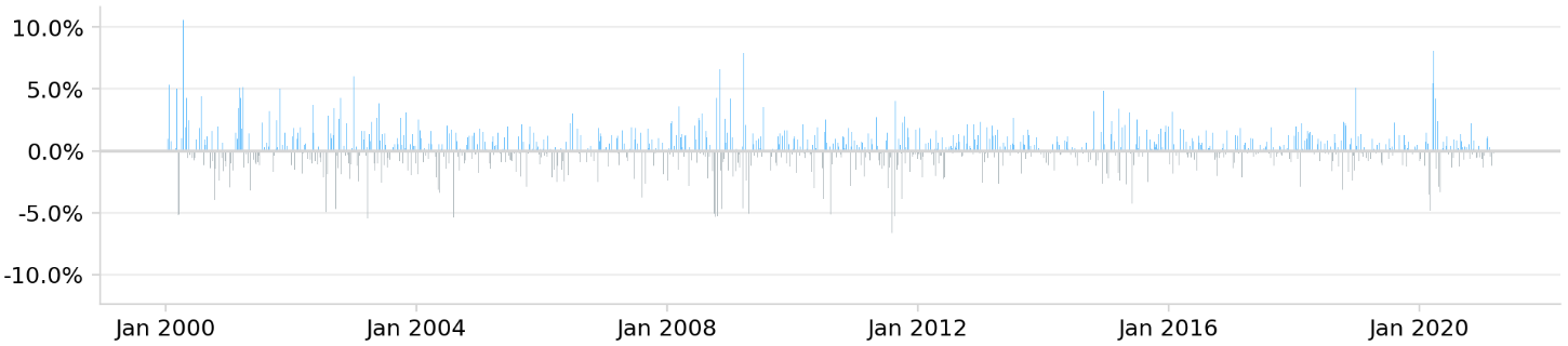
This chart displays the returns of each day. Blue bars represent profitable days and gray bars represent unprofitable days.
Monthly Returns
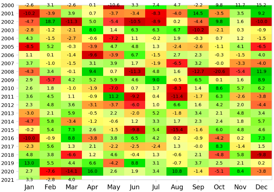
This chart displays the return of each month. We convert the original equity curve series into a monthly series and calculate the returns of each month. Green cells represent months with a positive return and red cells represent months with a negative return. Months that have a greater magnitude of returns are represented with darker cells. Yellow cells represent months with a relatively small gain or loss. White rectangles represent months that are not included in the backtest period. The values in the cells are percentages.
Annual Returns
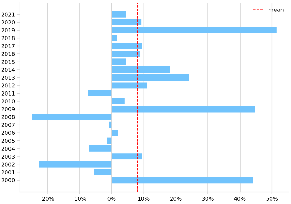
This chart displays the return of each year. We calculate the total return within each year and represent each year with a blue bar. The red dotted line represents the average of the annual returns.
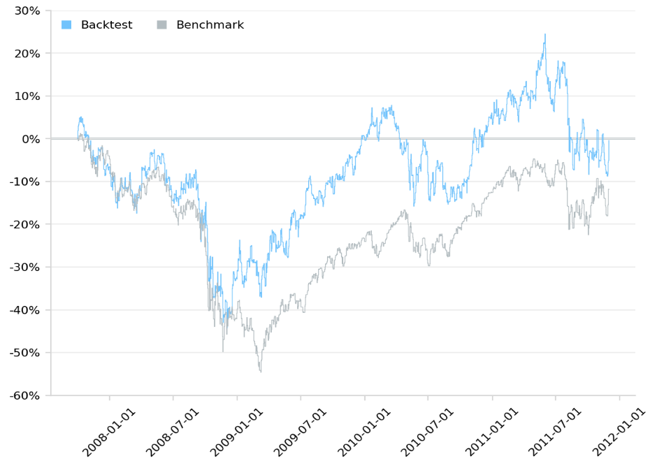
Cumulative Returns
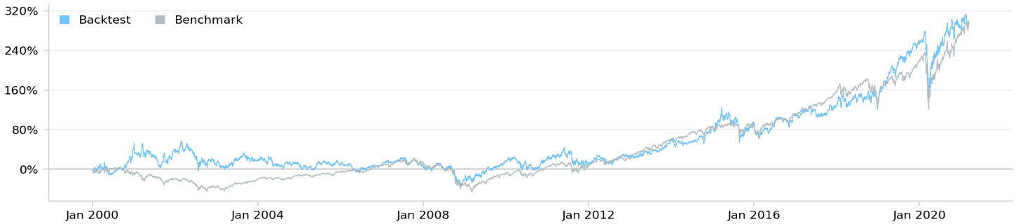
This chart displays the cumulative returns of your algorithm. The blue line represents your algorithm and the gray line represents the benchmark.

Drawdown
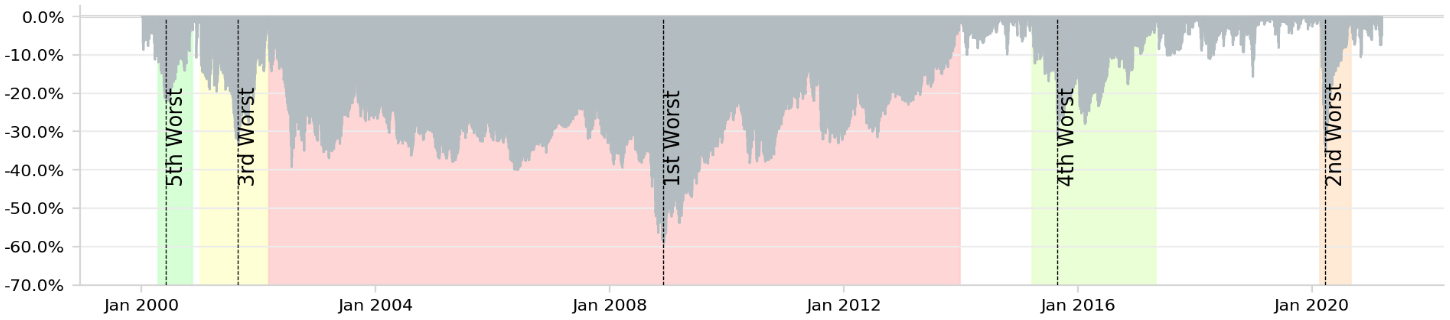
This chart displays the peak-to-trough drawdown of your portfolio's equity throughout the backtest period. The drawdown of each day is defined as the percentage loss since the maximum equity value before the current day. The drawdowns are calculated based on daily data. The top 5 drawdown periods are marked in the chart with different colors.
Rolling Statistics
The backtest report displays time series for your portfolio's rolling beta and Sharpe ratio.
Rolling Portfolio Beta
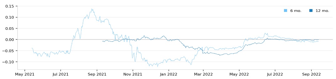
This chart displays the rolling portfolio beta over trailing 6 and 12 month periods. The light blue line represents the 6 month period and the dark blue line represents the 12 month period.
Rolling Sharpe Ratio
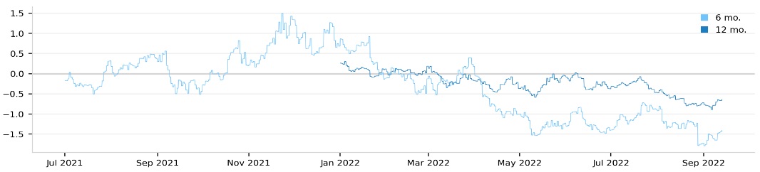
This chart displays the rolling portfolio Sharpe ratio over trailing 6 and 12 month periods.
The light blue line represents the 6 month period and the dark blue line represents the 12 month period.
Exposure
The backtest report displays time series for your portfolio's overall leverage and your portfolio's long-short exposure by asset class.
Leverage
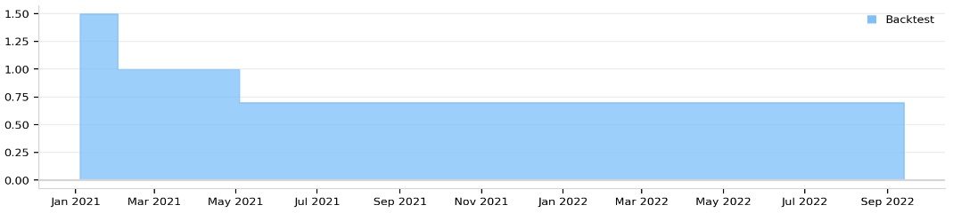
This chart displays your algorithm's utilization of leverage over time.
Long-Short Exposure By Asset Class
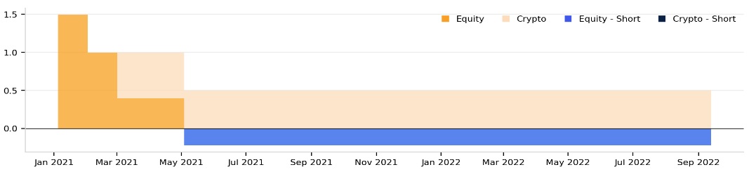
This chart displays your algorithm's long-short exposure by asset class over time.
Crisis Events
This set of charts displays the cumulative returns of your algorithm and the benchmark during various historical periods. The blue line represents the cumulative returns of your algorithm and the grey line represents the cumulative return of the benchmark. The report only contains the crisis event that occurred during your algorithm's backtest period. The following table shows the crisis events that may be included in your backtest report:
| Crisis Name | Start Date | End Date |
|---|---|---|
| DotCom Bubble 2000 | 2/26/2000 | 9/10/2000 |
| September 11, 2001 | 9/5/2001 | 10/10/2001 |
| U.S. Housing Bubble 2003 | 1/1/2003 | 2/20/2003 |
| Global Financial Crisis 2007 | 10/1/2007 | 12/1/2011 |
| Flash Crash 2010 | 5/1/2010 | 5/22/2010 |
| Fukushima Meltdown 2011 | 3/1/2011 | 4/22/2011 |
| U.S. Credit Downgrade 2011 | 8/5/2011 | 9/1/2011 |
| ECB IR Event 2012 | 9/5/2012 | 10/12/2012 |
| European Debt Crisis 2014 | 10/1/2014 | 10/29/2014 |
| Market Sell-Off 2015 | 8/10/2015 | 10/10/2015 |
| Recovery 2010-2012 | 1/1/2010 | 10/1/2012 |
| New Normal 2014-2019 | 1/1/2014 | 1/1/2019 |
| COVID-19 Pandemic 2020 | 2/10/2020 | 9/20/2020 |
| Post-COVID Run-up 2020-2021 | 4/1/2020 | 1/1/2022 |
| Meme Season 2021 | 1/1/2021 | 5/15/2021 |
| Russia Invades Ukraine 2022-2023 | 2/1/2022 | 1/1/2024 |
| AI Boom 2022-Present | 11/30/2022 | Present |
Parameters
This section of the report shows the name and value of all the parameters in your project.
Customize Reports
To create custom reports, customize the HTML and CSS.
Customize the Report HTML
The Report / template.html file in the LEAN GitHub repository defines the stucture of the reports you generate. To override the HTML file, add a report.html file to your project. To include some of the information and charts that are in the default report, use the report keys in the Report / ReportKey.cs file in the LEAN GitHub repository. For example, to add the Sharpe ratio of your backtest to the custom HTML file, use {{$KPI-SHARPE}}.
To include the crisis event plots in your report, add the {{$HTML-CRISIS-PLOTS}} key and then define the structure of the individual plots inside of <!--crisis and crisis-->. Inside of this comment, you can utilize the {{$TEXT-CRISIS-TITLE}} and {{$PLOT-CRISIS-CONTENT}} keys. For example, the following HTML is the default format for each crisis plot:
<!--crisis
<div class="col-xs-4">
    <table class="crisis-chart table compact">
        <thead>
        <tr>
            <th style="display: block; height: 75px;">{{$TEXT-CRISIS-TITLE}}</th>
        </tr>
        </thead>
        <tbody>
        <tr>
            <td style="padding:0;">
                <img src="{{$PLOT-CRISIS-CONTENT}}">
            </td>
        </tr>
        </tbody>
    </table>
</div>
crisis-->
To include the algorithm parameters in your report, add the {{$PARAMETERS}} key and then define the HTML element inside of <!--parameters and parameters-->. Inside of this comment, you can use special keys {{$KEY<parameterIndex>}} and {{$VALUE<parameterIndex>}}, which represent the key and value of a single parameter. For example, the following HTML is the default format for the parameters element:
<!--parameters
<tr>
    <td class = "title"> {{$KEY0}} </td><td> {{$VALUE0}} </td>
    <td class = "title"> {{$KEY1}} </td><td> {{$VALUE1}} </td>
</tr>
parameters-->
In the preceding example, {{$KEY0}} is the name of the first parameter in the algorithm and {{$VALUE0}} is its value.
Customize the Report CSS
The Report / css / report.css file in the LEAN GitHub repository defines the style of the reports you generate. To override the stylesheet, add a report.css file to your project.
Example
Clone this project to view an example project that creates reports with custom HTML and CSS. If you backtest the strategy in the project and then generate a report, you'll notice the report has a red banner at the top.
You can also see our Videos. You can also get in touch with us via Discord.
Did you find this page helpful?