Charting
Bokeh
Preparation
Import Libraries
To research with the Bokeh library, import the libraries that you need.
# Import the Bokeh library for plots and settings.
from bokeh.plotting import figure, show
from bokeh.models import BasicTicker, ColorBar, ColumnDataSource, LinearColorMapper
from bokeh.palettes import Category20c
from bokeh.transform import cumsum, transform
from bokeh.io import output_notebook

# Call the `output_notebook` method for displaying the plots in the jupyter notebook.
output_notebook()
Get Historical Data
Get some historical market data to produce the plots. For example, to get data for a bank sector ETF and some banking companies over 2021, run:
qb = QuantBook()
tickers = ["XLF",   # Financial Select Sector SPDR Fund
           "COF",   # Capital One Financial Corporation
           "GS",    # Goldman Sachs Group, Inc.
           "JPM",   # J P Morgan Chase & Co
           "WFC"]   # Wells Fargo & Company
symbols = [qb.add_equity(ticker, Resolution.DAILY).symbol for ticker in tickers]
history = qb.history(symbols, datetime(2021, 1, 1), datetime(2022, 1, 1))
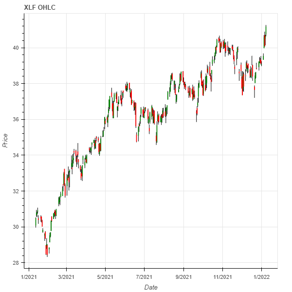
Create Candlestick Chart
You must import the plotting libraries and get some historical data to create candlestick charts.
In this example, you create a candlestick chart that shows the open, high, low, and close prices of one of the banking securities. Follow these steps to create the candlestick chart:
# Obtain the historical price data for a single symbol.
symbol = symbols[0]
data = history.loc[symbol]

# Divide the data into days with positive returns and days with negative returns, since they will be plotted in different colors.
up_days = data[data['close'] > data['open']]
down_days = data[data['open'] > data['close']]

# Create the figure instance with the axes.
plot = figure(title=f"{symbol} OHLC", x_axis_label='Date', y_axis_label='Price', x_axis_type='datetime')

# Plot the high to low price each day with a vertical black line.
plot.segment(data.index, data['high'], data.index, data['low'], color="black")

# Overlay the green or red box on top of the vertical line to create the candlesticks.
width = 12*60*60*1000
plot.vbar(up_days.index, width, up_days['open'], up_days['close'],
          fill_color="green", line_color="green")
plot.vbar(down_days.index, width, down_days['open'], down_days['close'],
          fill_color="red", line_color="red")

# Display the plot.
show(plot)
The Jupyter Notebook displays the candlestick chart.
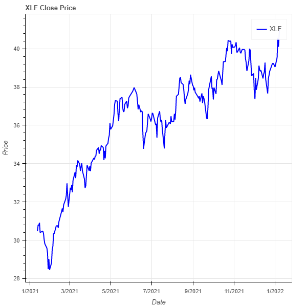
Create Line Plot
You must import the plotting libraries and get some historical data to create line charts.
In this example, you create a line chart that shows the closing price for one of the banking securities. Follow these steps to create the line chart:
# Obtain the close price series for a single symbol.
symbol = symbols[0]
close_prices = history.loc[symbol]['close']

# Create the figure instance with the axis settings.
plot = figure(title=f"{symbol} Close Price", x_axis_label='Date', y_axis_label='Price', x_axis_type='datetime')

# Plot the line chart with the timestamps, the close price series, and some design settings.
plot.line(close_prices.index, close_prices,
          legend_label=symbol.value, color="blue", line_width=2)

# Display the plot.
show(plot)
The Jupyter Notebook displays the line plot.
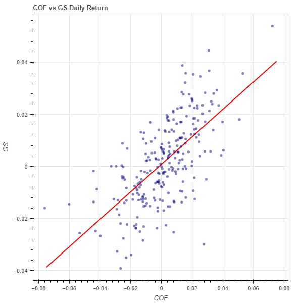
Create Scatter Plot
You must import the plotting libraries and get some historical data to create scatter plots.
In this example, you create a scatter plot that shows the relationship between the daily returns of two banking securities. Follow these steps to create the scatter plot:
# Select 2 stocks to plot the correlation between their return series.
symbol1 = symbols[1]
symbol2 = symbols[2]
close_price1 = history.loc[symbol1]['close']
close_price2 = history.loc[symbol2]['close']
daily_return1 = close_price1.pct_change().dropna()
daily_return2 = close_price2.pct_change().dropna()

# Fit a linear regression model on the correlation.
m, b = np.polyfit(daily_returns1, daily_returns2, deg=1)

# Generate a prediction line upon the linear regression model.
x = np.linspace(daily_returns1.min(), daily_returns1.max())
y = m*x + b

# Create the figure instance with the axis settings.
plot = figure(title=f"{symbol1} vs {symbol2} Daily Return",
              x_axis_label=symbol1.value, y_axis_label=symbol2.value)

# Call the line method with x- and y-axis values, a color, and a line width to plot the linear regression prediction line.
plot.line(x, y, color="red", line_width=2)

# Call the dot method with the daily_returns1, daily_returns2, and some design settings to plot the scatter plot dots of the daily returns.
plot.dot(daily_returns1, daily_returns2, size=20, color="navy", alpha=0.5)

# Display the plot.
show(plot)
The Jupyter Notebook displays the scatter plot.
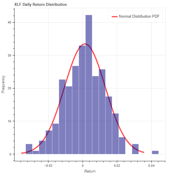
Create Histogram
You must import the plotting libraries and get some historical data to create histograms.
In this example, you create a histogram that shows the distribution of the daily percent returns of the bank sector ETF. In addition to the bins in the histogram, you overlay a normal distribution curve for comparison. Follow these steps to create the histogram:
# Obtain the daily return series for a single symbol.
symbol = symbols[0]
close_prices = history.loc[symbol]['close']
daily_returns = close_prices.pct_change().dropna()

# Call the histogram method with the daily_returns, the density argument enabled, and a number of bins.
hist, edges = np.histogram(daily_returns, density=True, bins=20)
# hist: The value of the probability density function at each bin, normalized such that the integral over the range is 1.
# edges: The x-axis value of the edges of each bin.

# Create the figure instance with the axis settings.
plot = figure(title=f"{symbol} Daily Return Distribution",
              x_axis_label='Return', y_axis_label='Frequency')

# Call the quad method with the coordinates of the bins and some design settings to plot the histogram bins.
plot.quad(top=hist, bottom=0, left=edges[:-1], right=edges[1:],
          fill_color="navy", line_color="white", alpha=0.5)

# Get the mean and standard deviation of the returns.
mean = daily_returns.mean()
std = daily_returns.std()
# Calculate the normal distribution PDF given the mean and SD.
x = np.linspace(-3*std, 3*std, 1000)
pdf = 1/(std * np.sqrt(2*np.pi)) * np.exp(-(x-mean)**2 / (2*std**2))
# Plot a normal distribution PDF curve of the daily returns.
plot.line(x, pdf, color="red", line_width=4,
          alpha=0.7, legend_label="Normal Distribution PDF")

# Display the plot.
show(plot)
The Jupyter Notebook displays the histogram.
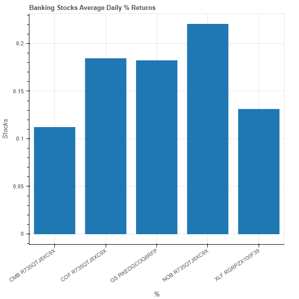
Create Bar Chart
You must import the plotting libraries and get some historical data to create bar charts.
In this example, you create a bar chart that shows the average daily percent return of the banking securities. Follow these steps to create the bar chart:
# Obtain the returns of all stocks to compare their return.
close_prices = history['close'].unstack(level=0)
daily_returns = close_prices.pct_change() * 100

# Obtain the mean of the daily return.
avg_daily_returns = daily_returns.mean()

# Call the DataFrame constructor with the data Series and then call the reset_index method.
avg_daily_returns = pd.DataFrame(avg_daily_returns, columns=['avg_return']).reset_index()

# Create the figure instance with the axis settings.
plot = figure(title='Banking Stocks Average Daily % Returns', x_range=avg_daily_returns['symbol'],
              x_axis_label='%', y_axis_label='Stocks')

Call the vbar method with the avg_daily_returns, x- and y-axis column names, and a bar width to plot the mean daily return bars.
plot.vbar(source=avg_daily_returns, x='symbol', top='avg_return', width=0.8)

# Rotate the x-axis label to display the plot axis properly.
plot.xaxis.major_label_orientation = 0.6

# Display the plot.
show(plot)
The Jupyter Notebook displays the bar chart.
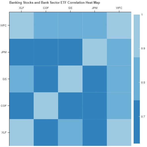
Create Heat Map
You must import the plotting libraries and get some historical data to create heat maps.
In this example, you create a heat map that shows the correlation between the daily returns of the banking securities. Follow these steps to create the heat map:
# Obtain the returns of all stocks to compare their return.
close_prices = history['close'].unstack(level=0)
daily_returns = close_prices.pct_change()

# Call the corr method to create the correlation matrix to plot.
corr_matrix = daily_returns.corr()
# Set the index and columns of the corr_matrix to the ticker of each security and then set the name of the column and row indices.
corr_matrix.index = corr_matrix.columns = [symbol.value for symbol in symbols]
corr_matrix.index.name = 'symbol'
corr_matrix.columns.name = "stocks"

# Call the stack, rename, and reset_index methods for ease of plotting.
corr_matrix = corr_matrix.stack().rename("value").reset_index()

# Create the figure instance with the axis settings.
plot = figure(title=f"Banking Stocks and Bank Sector ETF Correlation Heat Map",
              x_range=list(corr_matrix.symbol.drop_duplicates()),
              y_range=list(corr_matrix.stocks.drop_duplicates()),
              toolbar_location=None,
              tools="",
              x_axis_location="above")

# Select a color palette and then call the LinearColorMapper constructor with the color pallet, the minimum correlation, and the maximum correlation to set the heatmap color.
colors = Category20c[len(corr_matrix.columns)]
mapper = LinearColorMapper(palette=colors, low=corr_matrix.value.min(),
                           high=corr_matrix.value.max())

# Call the rect method with the correlation plot data and design setting to plot the heatmap.
plot.rect(source=ColumnDataSource(corr_matrix),
          x="stocks",
          y="symbol",
          width=1,
          height=1,
          line_color=None,
          fill_color=transform('value', mapper))

# Creates a color bar to represent the correlation coefficients of the heat map cells.
# Call the ColorBar constructor with the mapper, a location, and a BaseTicker.
color_bar = ColorBar(color_mapper=mapper,
                    location=(0, 0),
                    ticker=BasicTicker(desired_num_ticks=len(colors)))

# Plot the color bar to the right of the heat map.
# Call the add_layout method with the color_bar and a location.
plot.add_layout(color_bar, 'right')

# Display the plot.
show(plot)
The Jupyter Notebook displays the heat map.
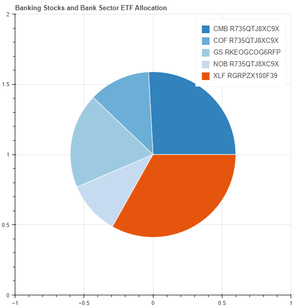
Create Pie Chart
You must import the plotting libraries and get some historical data to create pie charts.
In this example, you create a pie chart that shows the weights of the banking securities in a portfolio if you allocate to them based on their inverse volatility. Follow these steps to create the pie chart:
# Obtain the returns of all stocks to compare their return.
close_prices = history['close'].unstack(level=0)
daily_returns = close_prices.pct_change()

# Calculate the inverse of variances to plot with.
inverse_variance = 1 / daily_returns.var()
inverse_variance /= np.sum(inverse_variance)   # Normalization
inverse_variance *= np.pi*2    # For a full circle circumference in radian
# Call the DataFrame constructor with the inverse_variance Series and then call the reset_index method.
inverse_variance = pd.DataFrame(inverse_variance, columns=["inverse variance"]).reset_index()

# Add a color column to the inverse_variance DataFrame.
inverse_variance['color'] = Category20c[len(inverse_variance.index)]

# Create the figure instance with the title settings.
plot = figure(title=f"Banking Stocks and Bank Sector ETF Allocation")

# Call the wedge method with design settings and the inverse_variance DataFrame to plot the pie chart.
plot.wedge(x=0, y=1, radius=0.6, start_angle=cumsum('inverse variance', include_zero=True),
           end_angle=cumsum('inverse variance'), line_color="white", fill_color='color',
           legend_field='symbol', source=inverse_variance)

# Display the plot.
show(plot)
The Jupyter Notebook displays the pie chart.
You can also see our Videos. You can also get in touch with us via Discord.
Did you find this page helpful?