Meta Analysis
Live Analysis
Read Live Results
To get the results of a live algorithm, call the ReadLiveAlgorithmread_live_algorithm method with the project Id and deployment ID.
#load "../Initialize.csx"
#load "../QuantConnect.csx"
using QuantConnect;
using QuantConnect.Api;

var liveAlgorithm = api.ReadLiveAlgorithm(projectId, deployId);
live_algorithm = api.read_live_algorithm(project_id, deploy_id)
The following table provides links to documentation that explains how to get the project Id and deployment Id, depending on the platform you use:
| Platform | Project Id | Deployment Id |
|---|---|---|
| Cloud Platform | Get Project Id | Get Deployment Id |
| Local Platform | Get Project Id | Get Deployment Id |
| CLI | Get Project Id |
The ReadLiveAlgorithmread_live_algorithm method returns a LiveAlgorithmResults object, which have the following attributes:
Plot Order Fills
Follow these steps to plot the daily order fills of a live algorithm:
- Get the live trading orders.
-
Organize the trade times and prices for each security into a dictionary.
class OrderData: def __init__(self): self.buy_fill_times = [] self.buy_fill_prices = [] self.sell_fill_times = [] self.sell_fill_prices = [] order_data_by_symbol = {} for order in [x.order for x in orders]: if order.symbol not in order_data_by_symbol: order_data_by_symbol[order.symbol] = OrderData() order_data = order_data_by_symbol[order.symbol] is_buy = order.quantity > 0 (order_data.buy_fill_times if is_buy else order_data.sell_fill_times).append(order.last_fill_time.date()) (order_data.buy_fill_prices if is_buy else order_data.sell_fill_prices).append(order.price) -
Get the price history of each security you traded.
qb = QuantBook() start_date = datetime.max.date() end_date = datetime.min.date() for symbol, order_data in order_data_by_symbol.items(): if order_data.buy_fill_times: start_date = min(start_date, min(order_data.buy_fill_times)) end_date = max(end_date, max(order_data.buy_fill_times)) if order_data.sell_fill_times: start_date = min(start_date, min(order_data.sell_fill_times)) end_date = max(end_date, max(order_data.sell_fill_times)) start_date -= timedelta(days=3) all_history = qb.history(list(order_data_by_symbol.keys()), start_date, end_date, Resolution.DAILY) -
Create a candlestick plot for each security and annotate each plot with buy and sell markers.
import plotly.express as px
import plotly.graph_objects as go

for symbol, order_data in order_data_by_symbol.items():
    history = all_history.loc[symbol]

    # Plot security price candlesticks
    candlestick = go.Candlestick(x=history.index,
                                open=history['open'],
                                high=history['high'],
                                low=history['low'],
                                close=history['close'],
                                name='Price')
    layout = go.Layout(title=go.layout.Title(text=f'{symbol.value} Trades'),
                    xaxis_title='Date',
                    yaxis_title='Price',
                    xaxis_rangeslider_visible=False,
                    height=600)
    fig = go.Figure(data=[candlestick], layout=layout)

    # Plot buys
    fig.add_trace(go.Scatter(
        x=order_data.buy_fill_times,
        y=order_data.buy_fill_prices,
        marker=go.scatter.Marker(color='aqua', symbol='triangle-up', size=10),
        mode='markers',
        name='Buys',
    ))

    # Plot sells
    fig.add_trace(go.Scatter(
        x=order_data.sell_fill_times,
        y=order_data.sell_fill_prices,
        marker=go.scatter.Marker(color='indigo', symbol='triangle-down', size=10),
        mode='markers',
        name='Sells',
    ))

fig.show()
orders = api.read_live_orders(project_id)
The following table provides links to documentation that explains how to get the project Id, depending on the platform you use:
| Platform | Project Id |
|---|---|
| Cloud Platform | Get Project Id |
| Local Platform | Get Project Id |
| CLI | Get Project Id |
By default, the orders with an ID between 0 and 100. To get orders with an ID greater than 100, pass start and end arguments to the ReadLiveOrdersread_live_orders method. Note that end - start must be less than 100.
orders = api.read_live_orders(project_id, 100, 150)
The ReadLiveOrdersread_live_orders method returns a list of Order objects, which have the following properties:
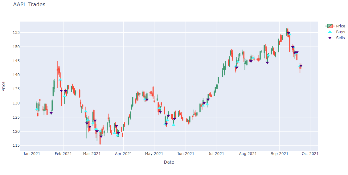
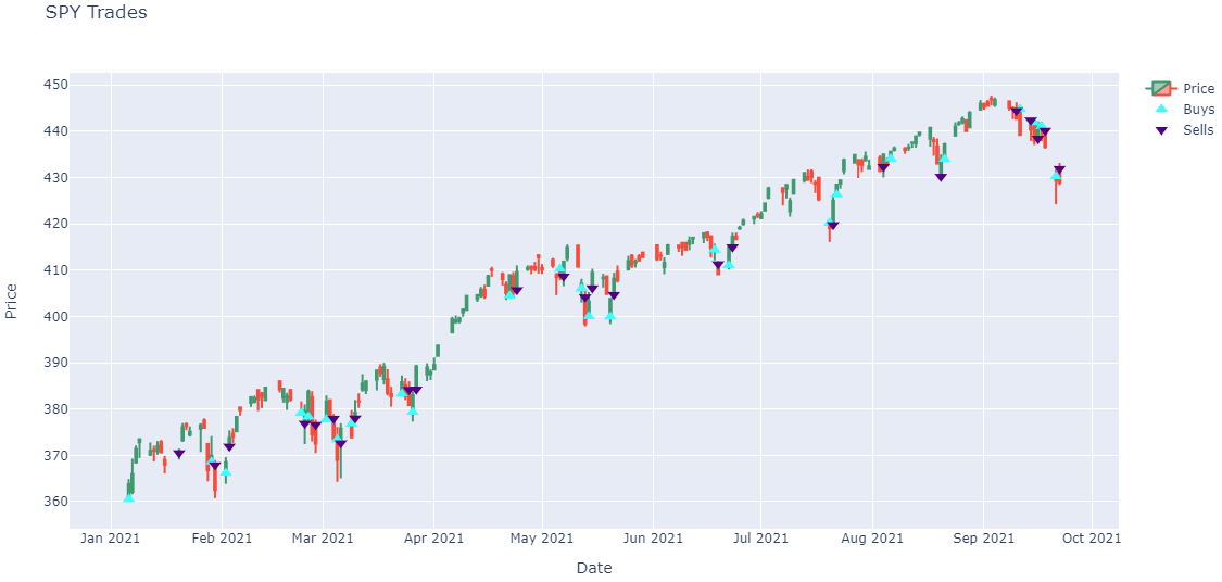
Note: The preceding plots only show the last fill of each trade. If your trade has partial fills, the plots only display the last fill.
Plot Charts
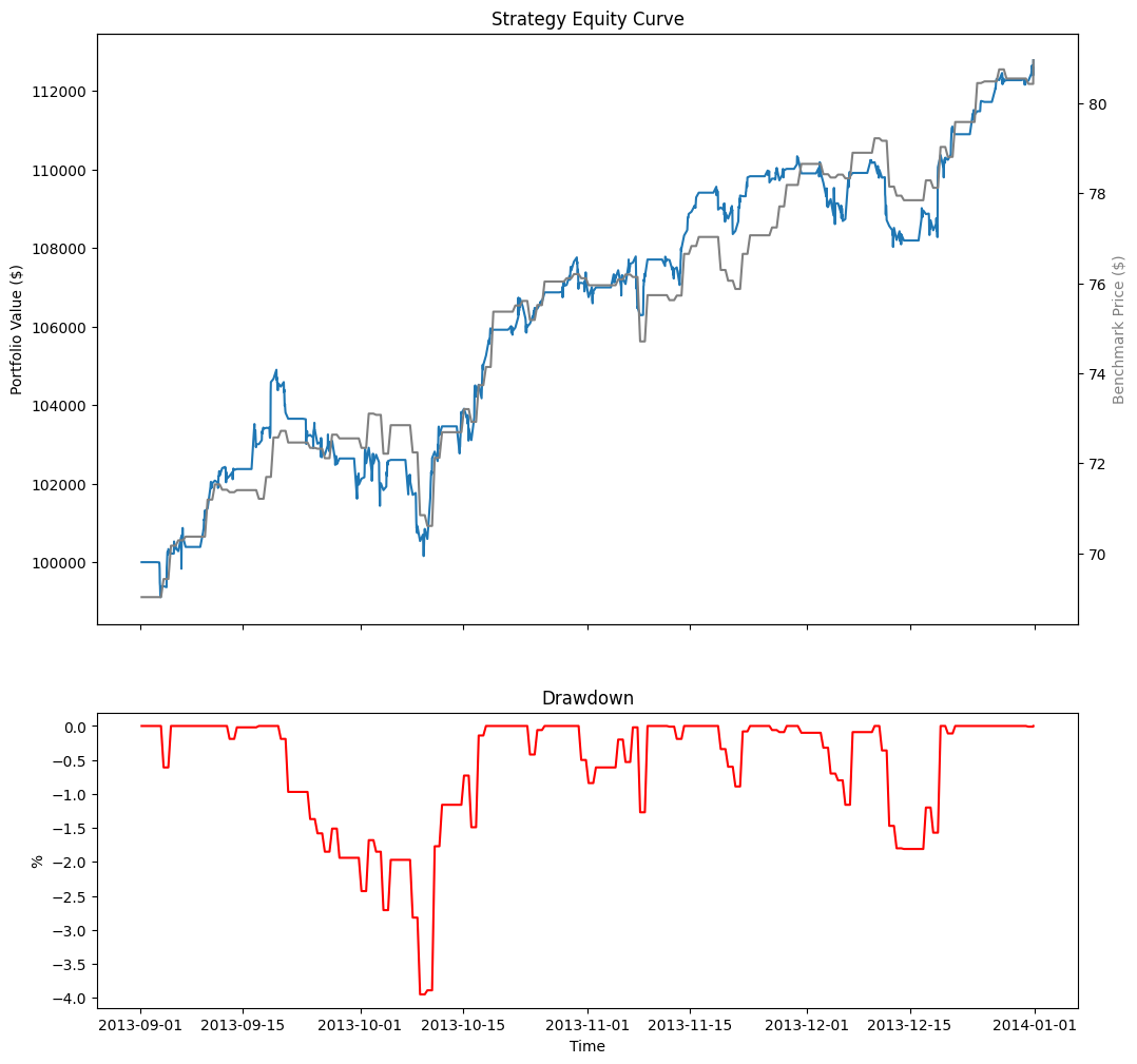
Follow these steps to plot the equity curve, benchmark, and drawdown of a live algorithm:
- Define the project Id and read the "Strategy Equity", "Drawdown", and "Benchmark" charts.
- Extract the series and create a
pandas.DataFrame. - Plot the performance chart.
from time import sleep, time

project_id = 23034953

def read_chart(project_id, chart_name, start=0, end=int(time()), count=500):
    # Retry up to 10 times if the chart data is still loading
    for attempt in range(10):
        result = api.read_live_chart(project_id, chart_name, start, end, count)
        if result.status == 'loading':
            print(f"Chart data is loading... (attempt {attempt + 1}/10)")
            sleep(10)
            continue
        break
    return result.chart

strategy_equity = read_chart(project_id, 'Strategy Equity')
drawdown_chart = read_chart(project_id, 'Drawdown')
benchmark_chart = read_chart(project_id, 'Benchmark')
The process to get your project Id depends on if you use the Cloud Platform, Local Platform, or CLI.
def to_series(chart, series_name, selector=lambda x: x.y):
    return pd.Series({v.time: selector(v) for v in chart.series[series_name].values})

df = pd.DataFrame({
    "Equity": to_series(strategy_equity, 'Equity', selector=lambda x: x.close),
    "Return": to_series(strategy_equity, 'Return'),
    "Drawdown": to_series(drawdown_chart, 'Equity Drawdown'),
    "Benchmark": to_series(benchmark_chart, 'Benchmark')
}).ffill()
df.index = df.index.tz_localize('UTC').tz_convert('US/Eastern').tz_localize(None)
# Create subplots to plot series on same/different plots
fig, ax = plt.subplots(3, 1, figsize=(12, 16), sharex=True, gridspec_kw={'height_ratios': [2, 1, 1]})

# Plot the equity curve
ax[0].plot(df.index, df["Equity"])
ax[0].set_title("Strategy Equity Curve")
ax[0].set_ylabel("Portfolio Value ($)")

# Plot the benchmark on the same plot, scale by using another y-axis
ax2 = ax[0].twinx()
ax2.plot(df.index, df["Benchmark"], color="grey")
ax2.set_ylabel("Benchmark Price ($)", color="grey")

# Plot the daily returns
ax[1].plot(df.index, df["Return"], color="blue")
ax[1].set_title("Daily Return")
ax[1].set_ylabel("%")

# Plot the drawdown on another plot
ax[2].plot(df.index, df["Drawdown"], color="red")
ax[2].set_title("Drawdown")
ax[2].set_xlabel("Time")
ax[2].set_ylabel("%");
The following table shows all the chart series you can plot:
| Chart | Series | Description |
|---|---|---|
| Strategy Equity | Equity | Time series of the equity curve. This series may not update daily. |
| Return | Time series of daily returns. Use this series for daily updates. | |
| Daily Performance | Time series of daily percentage change. This series has as many data points as "Equity". | |
| Capacity | Strategy Capacity | Time series of strategy capacity snapshots |
| Drawdown | Equity Drawdown | Time series of equity peak-to-trough value |
| Benchmark | Benchmark | Time series of the benchmark closing price (SPY, by default) |
| Exposure | SecurityType - Long Ratio | Time series of the overall ratio of SecurityType long positions of the whole portfolio if any SecurityType is ever in the universe |
| SecurityType - Short Ratio | Time series of the overall ratio of SecurityType short position of the whole portfolio if any SecurityType is ever in the universe | |
| Assets Sales Volume | Each ticker is one series | A chart showing the proportion of total volume for each traded security. |
| Portfolio Turnover | Portfolio Turnover | A time series of the portfolio turnover rate. |
| Portfolio Margin | Each ticker is one series | A stacked area chart of the portfolio margin usage. For more information about this chart, see Portfolio Margin Plots. |
| Asset Plot | Price and Annotations | A time series of an asset's price with order event annotations. For more information about these charts, see Asset Plots. |
| Custom Chart | Custom Series | Time series of a Series in a custom chart |
Example
Example 1: Read Live Algorithm Statistics
The following example reads the current running live algorithm's statistics in a jupyter notebook.
// Load the necessary assemblies.
#load "../Initialize.csx"
// Load the necessary assembly files.
#load "../QuantConnect.csx"
using QuantConnect;
using QuantConnect.Api;
using QuantConnect.Research;

// Instantiate QuantBook instance for researching.
var qb = new QuantBook();

// Get current running live algorithm list in the current project.
var liveAlgorithms = api.ListLiveAlgorithms(AlgorithmStatus.Running)
var deployId = liveAlgorithms.Algorithms
    .Single(x => x.ProjectId == qb.ProjectId)
    .DeployId;
var liveAlgorithm = api.ReadLiveAlgorithm(qb.ProjectId, deployId);

// Obtain the live algorithm statistics.
Console.WriteLine(backtest.RuntimeStatistics.ToString());
# Instantiate QuantBook instance for researching.
qb = QuantBook()
# Get current running live algorithm list in the current project.
live_algorithms = api.list_live_algorithms(AlgorithmStatus.RUNNING)
deploy_id = next(
[x for x in live_algorithms.algorithms if x.project_id == qb.project_id]
).deploy_id
live_algorithm = api.read_live_algorithm(project_id, deploy_id)
# Obtain the live algorithm statistics.
print(live_algorithm.runtime_statistics)
You can also see our Videos. You can also get in touch with us via Discord.
Did you find this page helpful?