Charting
Plotly NET
Preparation
Import Libraries
To research with the Plotly.NET library, import the libraries that you need.
// Load the assembly files and data types in their own cell.
#load "../Initialize.csx"
// Load the necessary assembly files.
#load "../QuantConnect.csx"
#r "nuget: Plotly.NET"
#r "nuget: Plotly.NET.Interactive"
// Import the QuantConnect, Plotly.NET, and Accord packages for calculation and plotting.
using QuantConnect;
using QuantConnect.Research;

using Plotly.NET;
using Plotly.NET.Interactive;
using Plotly.NET.LayoutObjects;

using Accord.Math;
using Accord.Statistics;
Get Historical Data
Get some historical market data to produce the plots. For example, to get data for a bank sector ETF and some banking companies over 2021, run:
var qb = new QuantBook();
var tickers = new[]
{
    "XLF",  // Financial Select Sector SPDR Fund
    "COF",  // Capital One Financial Corporation
    "GS",   // Goldman Sachs Group, Inc.
    "JPM",  // J P Morgan Chase & Co
    "WFC"   // Wells Fargo & Company
};
var symbols = tickers.Select(ticker => qb.AddEquity(ticker, Resolution.Daily).Symbol);
var history = qb.History(symbols, new DateTime(2021, 1, 1), new DateTime(2022, 1, 1));
Create Candlestick Chart
You must import the plotting libraries and get some historical data to create candlestick charts.
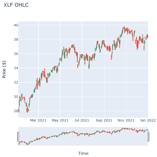
In this example, you create a candlestick chart that shows the open, high, low, and close prices of one of the banking securities. Follow these steps to create the candlestick chart:
// Select a symbol to plot its candlestick plot.
var symbol = symbols.First();

// Call the Chart2D.Chart.Candlestick constructor with the time and open, high, low, and close price IEnumerable to create the candlestick plot.
var bars = history.Select(slice => slice.Bars[symbol]);
var chart = Chart2D.Chart.Candlestick<decimal, decimal, decimal, decimal, DateTime, string>(
    bars.Select(x => x.Open),
    bars.Select(x => x.High),
    bars.Select(x => x.Low),
    bars.Select(x => x.Close),
    bars.Select(x => x.EndTime)
);

// Call the Layout constructor and set the title, xaxis, and yaxis properties as the title and axes label objects to create the plot layout.
LinearAxis xAxis = new LinearAxis();
xAxis.SetValue("title", "Time");
LinearAxis yAxis = new LinearAxis();
yAxis.SetValue("title", "Price ($)");
Title title = Title.init($"{symbol} OHLC");

Layout layout = new Layout();
layout.SetValue("xaxis", xAxis);
layout.SetValue("yaxis", yAxis);
layout.SetValue("title", title);

// Assign the Layout to the chart.
chart.WithLayout(layout);

// Show the plot.
display(chart);
The Jupyter Notebook displays the candlestick chart.
Create Line Chart
You must import the plotting libraries and get some historical data to create candlestick charts.
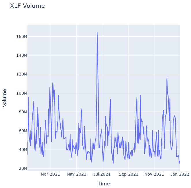
In this example, you create a line chart that shows the volume of a security. Follow these steps to create the chart:
// Select a symbol to plot its volume as line chart.
var symbol = symbols.First();

// Call the Chart2D.Chart.Line constructor with the timestamps and volumes to create the line chart.
var bars = history.Select(slice => slice.Bars[symbol]);
var chart = Chart2D.Chart.Line<DateTime, decimal, string>(
    bars.Select(x => x.EndTime),
    bars.Select(x => x.Volume)
);

// Create a Layout for the plot setting.
LinearAxis xAxis = new LinearAxis();
xAxis.SetValue("title", "Time");
LinearAxis yAxis = new LinearAxis();
yAxis.SetValue("title", "Volume");
Title title = Title.init($"{symbol} Volume");

Layout layout = new Layout();
layout.SetValue("xaxis", xAxis);
layout.SetValue("yaxis", yAxis);
layout.SetValue("title", title);

// Assign the Layout to the chart.
chart.WithLayout(layout);

// Show the plot.
display(chart);
The Jupyter Notebook displays the line chart.
Create Scatter Plot
You must import the plotting libraries and get some historical data to create candlestick charts.
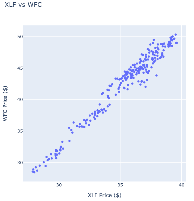
In this example, you create a scatter plot that shows the relationship between the daily price of two securities. Follow these steps to create the scatter plot:
// Select 2 symbols to plot their price correlation.
var symbol1 = symbols.First();
var symbol2 = symbols.Last();

// Call the Chart2D.Chart.Point constructor with the closing prices of both securities to create the scatter plot.
var chart = Chart2D.Chart.Point<decimal, decimal, string>(
    history.Select(slice => slice.Bars[symbol1].Close),
    history.Select(slice => slice.Bars[symbol2].Close)
);

// Create a Layout as the plot setting.
LinearAxis xAxis = new LinearAxis();
xAxis.SetValue("title", $"{symbol1} Price ($)");
LinearAxis yAxis = new LinearAxis();
yAxis.SetValue("title", $"{symbol2} Price ($)");
Title title = Title.init($"{symbol1} vs {symbol2}");

Layout layout = new Layout();
layout.SetValue("xaxis", xAxis);
layout.SetValue("yaxis", yAxis);
layout.SetValue("title", title);

// Assign the Layout to the chart.
chart.WithLayout(layout);

// Show the plot.
display(chart);
The Jupyter Notebook displays the scatter plot.
Create Heat Map
You must import the plotting libraries and get some historical data to create candlestick charts.
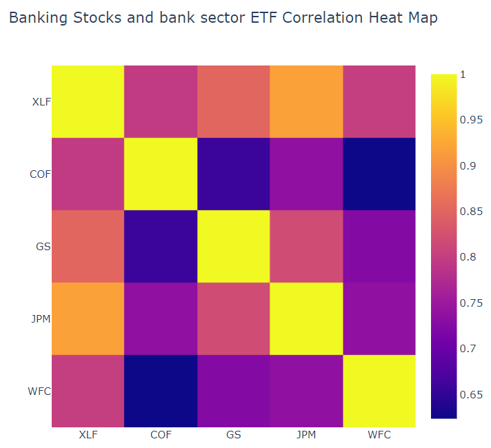
In this example, you create a heat map that shows the correlation between the daily returns of the banking securities. Follow these steps to create the heat map:
// Compute the daily returns of the stocks to calculate the correlation later.
var data = history.SelectMany(x => x.Bars.Values)
    .GroupBy(x => x.Symbol)
    .Select(x =>
    {
        var prices = x.Select(x => (double)x.Close).ToArray();
        return Enumerable.Range(0, prices.Length - 1)
            .Select(i => prices[i+1] / prices[i] - 1).ToArray();
    }).ToArray().Transpose();

// Call the Measures.Correlation method to calculate the correlation matrix for plotting.
var corrMatrix = Measures.Correlation(data).Select(x => x.ToList()).ToList();

// Call the Plotly.NET.Chart2D.Chart.Heatmap constructor with the correlation matrix to plot the heat map.
var X = Enumerable.Range(0, tickers.Length).ToList();

var heatmap = Plotly.NET.Chart2D.Chart.Heatmap<IEnumerable<double>, double, int, int, string>(
    zData: corr,
    X: X,
    Y: X,
    ShowScale: true,
    ReverseYAxis: true
);

// Create a Layout as the plot settings.
var axis = new LinearAxis();
axis.SetValue("tickvals", X);
axis.SetValue("ticktext", tickers);

var layout = new Layout();
layout.SetValue("xaxis", axis);
layout.SetValue("yaxis", axis);
layout.SetValue("title", Title.init("Banking Stocks and bank sector ETF Correlation Heat Map"));

// Assign the Layout to the chart.
heatmap.WithLayout(layout);

// Show the plot.
display(heatmap)
The Jupyter Notebook displays the heat map.
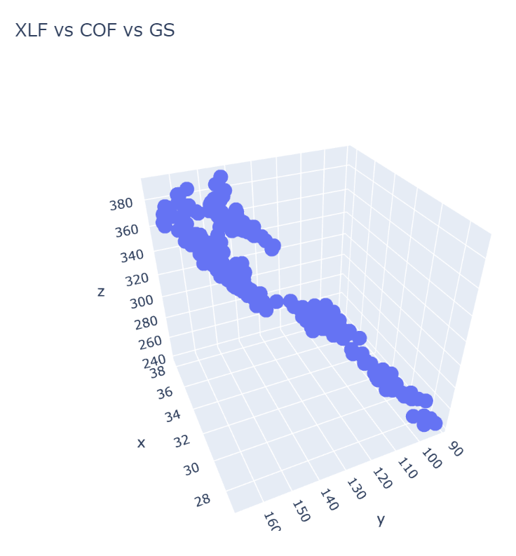
Create 3D Chart
You must import the plotting libraries and get some historical data to create candlestick charts.
In this example, you create a 3D chart that shows the price of an asset on each dimension, i.e. the price correlation of 3 different symbols. Follow these steps to create the 3D chart:
// Select three Symbol objects to plot with.
var symbolList = symbols.ToList();
var symbol1 = symbolList[0];
var symbol2 = symbolList[1];
var symbol3 = symbolList[2];

// Call the Chart3D.Chart.Point3D constructor with the closing price series of each securities to create the 3D scatter plot.
var chart = Chart3D.Chart.Point3D<decimal, decimal, decimal, string>(
    history.Select(slice => slice.Bars[symbol1].Close),
    history.Select(slice => slice.Bars[symbol2].Close),
    history.Select(slice => slice.Bars[symbol3].Close)
);

// Create a Layout to add title and axis labels as the plot settings.
LinearAxis xAxis = new LinearAxis();
xAxis.SetValue("title", $"{symbol1} Price ($)");
LinearAxis yAxis = new LinearAxis();
yAxis.SetValue("title", $"{symbol2} Price ($)");
LinearAxis zAxis = new LinearAxis();
zAxis.SetValue("title", $"{symbol3} Price ($)");
Title title = Title.init($"{symbol1} vs {symbol2} vs {symbol3}");

Layout layout = new Layout();
layout.SetValue("xaxis", xAxis);
layout.SetValue("yaxis", yAxis);
layout.SetValue("zaxis", zAxis);
layout.SetValue("title", title);

// Assign the Layout to the chart.
chart.WithLayout(layout);

// Show the plot.
display(chart)
The Jupyter Notebook displays the scatter plot.
You can also see our Videos. You can also get in touch with us via Discord.
Did you find this page helpful?