Charting
Seaborn
Preparation
Import Libraries
To research with the Seaborn library, import the libraries that you need.
import seaborn as sns
import matplotlib.pyplot as plt
from pandas.plotting import register_matplotlib_converters
register_matplotlib_converters()
Get Historical Data
Get some historical market data to produce the plots. For example, to get data for a bank sector ETF and some banking companies over 2021, run:
qb = QuantBook()
tickers = ["XLF",   # Financial Select Sector SPDR Fund
           "COF",   # Capital One Financial Corporation
           "GS",    # Goldman Sachs Group, Inc.
           "JPM",   # J P Morgan Chase & Co
           "WFC"]   # Wells Fargo & Company
symbols = [qb.add_equity(ticker, Resolution.DAILY).symbol for ticker in tickers]
history = qb.history(symbols, datetime(2021, 1, 1), datetime(2022, 1, 1))
Create Candlestick Chart
Seaborn does not currently support candlestick charts. Use one of the other plotting libraries to create candlestick charts.
Create Line Chart
You must import the plotting libraries and get some historical data to create candlestick charts.
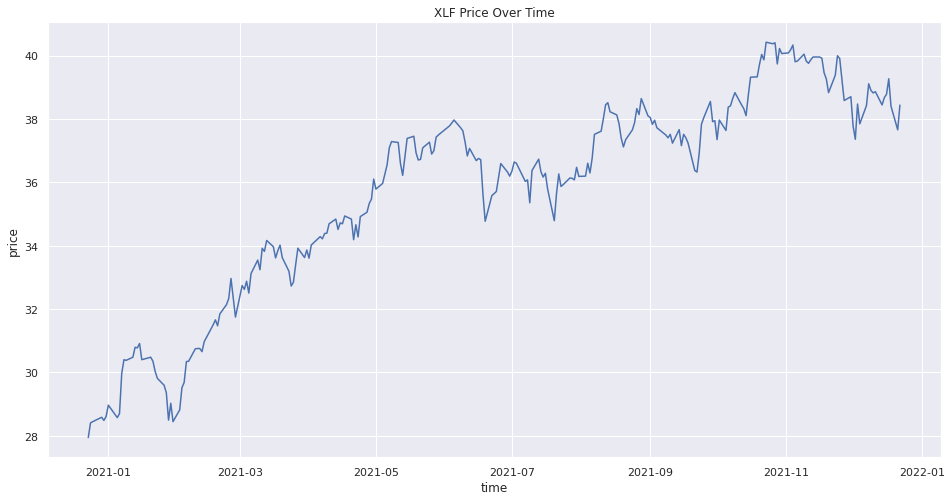
In this example, you create a line chart that shows the closing price for one of the banking securities. Follow these steps to create the line chart:
# Select a symbol to plot the candlestick plot.
symbol = symbols[0]

# Obtain the close price series of the symbol to plot.
data = history.loc[symbol]['close']

# Call the plot method with a title and figure size to plot the line chart.
plot = sns.lineplot(data=data,
                    x='time',
                    y='close')
# In the same cell that you called the lineplot method, call the set method with the y-axis label and a title to update the plot settings.
plot.set(ylabel="price", title=f"{symbol} Price Over Time")
The Jupyter Notebook displays the line chart.
Create Scatter Plot
You must import the plotting libraries and get some historical data to create candlestick charts.
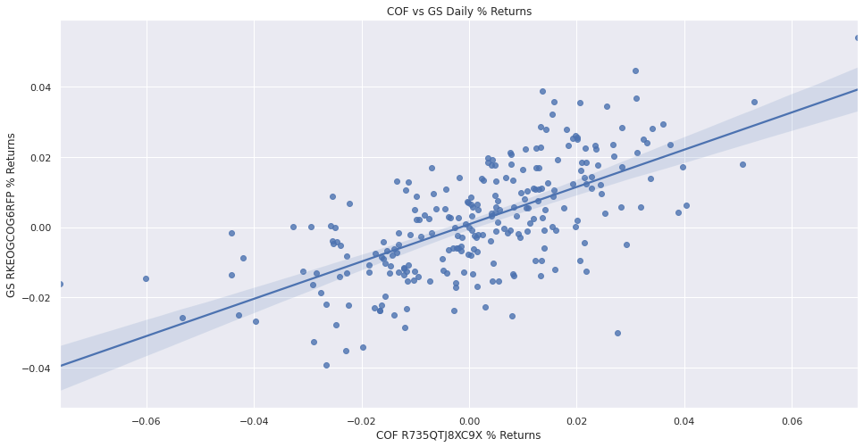
In this example, you create a scatter plot that shows the relationship between the daily returns of two banking securities. Follow these steps to create the scatter plot:
# Select 2 stocks to plot the correlation between their return series.
symbol1 = symbols[1]
symbol2 = symbols[2]
# Select the close column of the history DataFrame, call the unstack method, and then select the symbol1 and symbol2 columns.
close_prices = history['close'].unstack(0)[[symbol1, symbol2]]
# Obtain the daily return series of the 2 symbols to plot with.
daily_returns = close_prices.pct_change().dropna()

# Call the regplot method with the daily_returns DataFrame and the column names to plot the scatter plot.
plot = sns.regplot(data=daily_returns,
                   x=daily_returns.columns[0],
                   y=daily_returns.columns[1])
# In the same cell that you called the regplot method, call the set method with the axis labels and a title to update the layout.
plt.scatter(daily_returns1, daily_returns2)

# In the same cell, call the title, xlabel, and ylabel methods with a title and axis labels to decorate the plot.
plot.set(xlabel=f'{daily_returns.columns[0]} % Returns',
         ylabel=f'{daily_returns.columns[1]} % Returns',
         title=f'{symbol1} vs {symbol2} Daily % Returns')
The Jupyter Notebook displays the scatter plot.
Create Histogram
You must import the plotting libraries and get some historical data to create candlestick charts.
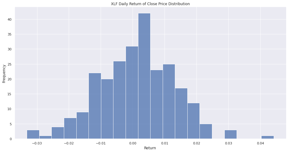
In this example, you create a histogram that shows the distribution of the daily percent returns of the bank sector ETF. Follow these steps to create the histogram:
# Obtain the daily return series for a single symbol.
symbol = symbols[0]
close_prices = history.loc[symbol]['close']
daily_returns = close_prices.pct_change().dropna()

# Call the DataFrame constructor with the daily_returns Series and then call the reset_index method.
daily_returns = pd.DataFrame(daily_returns).reset_index()

# Call the histplot method with the daily_returns, the close column name, and the number of bins to plot the histogram.
plot = sns.histplot(daily_returns, x='close', bins=20)
# In the same cell that you called the histplot method, call the set method with the axis labels and a title to update the layout.
plot.set(xlabel='Return',
         ylabel='Frequency',
         title=f'{symbol} Daily Return of Close Price Distribution')
The Jupyter Notebook displays the histogram.
Create Bar Chart
You must import the plotting libraries and get some historical data to create candlestick charts.
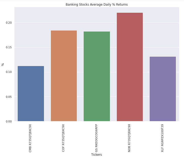
In this example, you create a bar chart that shows the average daily percent return of the banking securities. Follow these steps to create the bar chart:
# Obtain the returns of all stocks to compare their return.
close_prices = history['close'].unstack(level=0)
daily_returns = close_prices.pct_change() * 100

# Obtain the mean of the daily return.
avg_daily_returns = daily_returns.mean()

# Call the DataFrame constructor with the avg_daily_returns Series and then call the reset_index method.
avg_daily_returns = pd.DataFrame(avg_daily_returns, columns=["avg_daily_ret"]).reset_index()

# Call barplot method with the avg_daily_returns Series and the axes column names to plot the bar chart.
plot = sns.barplot(data=avg_daily_returns, x='symbol', y='avg_daily_ret')
# In the same cell that you called the barplot method, call the set method with the axis labels and a title to update layout.
plot.set(xlabel='Tickers',
         ylabel='%',
         title='Banking Stocks Average Daily % Returns')
# In the same cell that you called the set method, call the tick_params method to rotate the x-axis labels to rotate the labels of the x-axis for visibility.
plot.tick_params(axis='x', rotation=90)
The Jupyter Notebook displays the bar chart.
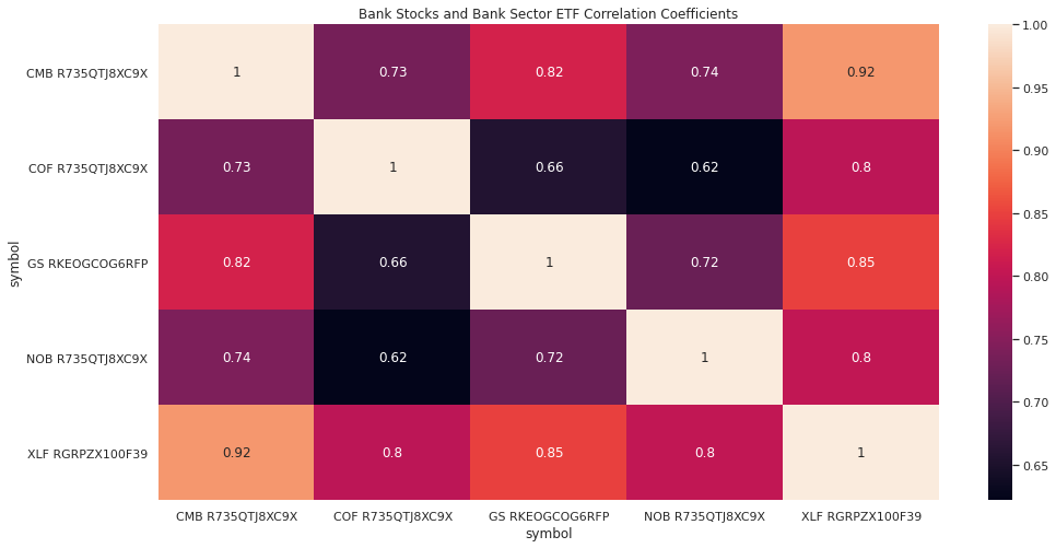
Create Heat Map
You must import the plotting libraries and get some historical data to create candlestick charts.
In this example, you create a heat map that shows the correlation between the daily returns of the banking securities. Follow these steps to create the heat map:
# Obtain the returns of all stocks to compare their return.
close_prices = history['close'].unstack(level=0)
daily_returns = close_prices.pct_change()

# Call the corr method to create the correlation matrix to plot.
corr_matrix = daily_returns.corr()

# Call the heatmap method with the corr_matrix and the annotation argument enabled to plot the heapmap.interpolation method to plot the heatmap.
plot = sns.heatmap(corr_matrix, annot=True)
# In the same cell that you called the heatmap method, call the set method with a title to update the layout.
plot.set(title='Bank Stocks and Bank Sector ETF Correlation Coefficients')
The Jupyter Notebook displays the heat map.
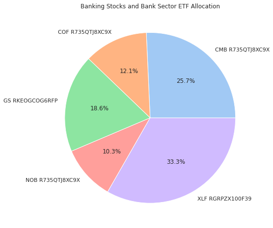
Create Pie Chart
You must import the plotting libraries and get some historical data to create candlestick charts.
In this example, you create a pie chart that shows the weights of the banking securities in a portfolio if you allocate to them based on their inverse volatility. Follow these steps to create the pie chart:
# Obtain the returns of all stocks to compare their return.
close_prices = history['close'].unstack(level=0)
daily_returns = close_prices.pct_change()

# Calculate the inverse of variances to plot with.
inverse_variance = 1 / daily_returns.var()

# Call the color_palette method with a palette name and then truncate the returned colors to so that you have one color for each security.
colors = sns.color_palette('pastel')[:len(inverse_variance.index)]

# Call the pie method with the security weights, labels, and colors to plot the pie chart.
plt.pie(inverse_variance, labels=inverse_variance.index, colors=colors, autopct='%1.1f%%')
# In the same cell that you called the pie method, call the title method with a title to update the layout.
plt.title(title='Banking Stocks and Bank Sector ETF Allocation')
The Jupyter Notebook displays the pie chart.
You can also see our Videos. You can also get in touch with us via Discord.
Did you find this page helpful?