Datasets
Equity Fundamental Data
Introduction
This page explains how to request, manipulate, and visualize historical Equity Fundamental data. Corporate fundamental data is available through the US Fundamental Data from Morningstar.
Create Subscriptions
Follow these steps to subscribe to an Equity security:
- Load the assembly files and data types in their own cell.
- Load the necessary assembly files.
- Import the data types.
- Create a
QuantBook. - Call the
AddEquityadd_equitymethod with a ticker and then save a reference to the EquitySymbol.
#load "../Initialize.csx"
#load "../QuantConnect.csx"
#r "../Microsoft.Data.Analysis.dll"
using QuantConnect;
using QuantConnect.Data;
using QuantConnect.Algorithm;
using QuantConnect.Research;
using QuantConnect.Indicators;
using QuantConnect.Data.Fundamental;
using Microsoft.Data.Analysis;
var qb = new QuantBook();
qb = QuantBook()
var symbols = new []
{
    "AAL",  // American Airlines Group, Inc.
    "ALGT", // Allegiant Travel Company
    "ALK",  // Alaska Air Group, Inc.
    "DAL",  // Delta Air Lines, Inc.
    "LUV",  // Southwest Airlines Company
    "SKYW", // SkyWest, Inc.
    "UAL"   // United Air Lines
}
.Select(ticker => qb.AddEquity(ticker, Resolution.Daily).Symbol);
symbols = [
qb.add_equity(ticker, Resolution.DAILY).symbol
for ticker in [
"AAL", # American Airlines Group, Inc.
"ALGT", # Allegiant Travel Company
"ALK", # Alaska Air Group, Inc.
"DAL", # Delta Air Lines, Inc.
"LUV", # Southwest Airlines Company
"SKYW", # SkyWest, Inc.
"UAL" # United Air Lines
]
]
Get Historical Data
You need a subscription before you can request historical fundamental data for US Equities.
On the time dimension, you can request an amount of historical data based on a trailing number of bars, a trailing period of time, or a defined period of time.
On the security dimension, you can request historical data for a single US Equity, a set of US Equities, or all of the US Equities in the US Fundamental dataset.
On the property dimension, you can call the Historyhistory method to get all fundamental properties.
When you call the Historyhistory method, you can request Fundamental or Fundamentals objects.
If you use Fundamental, the method returns all fundamental properties for the Symbol object(s) you provide.
If you use Fundamentals, the method returns all fundamental properties for all the US Equities in the US Fundamental dataset that were trading during that time period you request, including companies that no longer trade.
Trailing Number of Trading Days
To get historical data for a number of trailing trading days, call the Historyhistory method with the number of trading days. If you didn't use Resolution.DailyResolution.DAILY when you subscribed to the US Equities, pass it as the last argument to the Historyhistory method.
// Fundamental objects
var singleFundamentalHistory = qb.History<Fundamental>(symbols.First(), 10);
var setFundamentalHistory = qb.History<Fundamental>(symbols, 10);
var allFundamentalHistory = qb.History<Fundamental>(qb.Securities.Keys, 10);

// Fundamentals objects
var allFundamentalsHistory = qb.History<Fundamentals>(qb.Securities.Keys, 10);
# DataFrame of fundamental data single_fundamental_df = qb.history(Fundamental, symbols[0], 10, flatten=True) set_fundamental_df = qb.history(Fundamental, symbols, 10, flatten=True) all_fundamental_df = qb.history(Fundamental, qb.securities.keys(), 10, flatten=True) all_fundamentals_df = qb.history(Fundamentals, 10, flatten=True) # Fundamental objects single_fundamental_history = qb.history[Fundamental](symbols[0], 10) set_fundamental_history = qb.history[Fundamental](symbols, 10) all_fundamental_history = qb.history[Fundamental](qb.securities.keys(), 10) # Fundamentals objects all_fundamentals_history = qb.history[Fundamentals](qb.securities.keys(), 10)
The preceding calls return fundamental data for the 10 most recent trading days.
Trailing Period of Time
To get historical data for a trailing period of time, call the Historyhistory method with a TimeSpantimedelta object.
// Fundamental objects
var singleFundamentalHistory = qb.History<Fundamental>(symbols.First(), TimeSpan.FromDays(10));
var setFundamentalHistory = qb.History<Fundamental>(symbols, TimeSpan.FromDays(10));
var allFundamentalHistory = qb.History<Fundamental>(qb.Securities.Keys, TimeSpan.FromDays(10));

// Fundamentals objects
var allFundamentalsHistory = qb.History<Fundamentals>(TimeSpan.FromDays(10));
# DataFrame of fundamental data single_fundamental_df = qb.history(Fundamental, symbols[0], timedelta(days=10), flatten=True) set_fundamental_df = qb.history(Fundamental, symbols, timedelta(days=10), flatten=True) all_fundamental_df = qb.history(Fundamental, qb.securities.keys(), timedelta(days=10), flatten=True) all_fundamentals_df = qb.history(Fundamentals, timedelta(5), flatten=True) # Fundamental objects single_fundamental_history = qb.history[Fundamental](symbols[0], timedelta(days=10)) set_fundamental_history = qb.history[Fundamental](symbols, timedelta(days=10)) all_fundamental_history = qb.history[Fundamental](qb.securities.keys(), timedelta(days=10)) # Fundamentals objects all_fundamentals_history = qb.history[Fundamentals](timedelta(days=10))
The preceding calls return fundamental data for the most recent trading days.
Defined Period of Time
To get the historical data of all the fundamental properties over specific period of time, call the Historyhistory method with a start DateTimedatetime and an end DateTimedatetime.
To view the possible fundamental properties, see the Fundamental attributes in Data Point Attributes.
The start and end times you provide to these methods are based in the notebook time zone.
var startDate = new DateTime(2021, 1, 1);
var endDate = new DateTime(2021, 2, 1);

// Fundamental objects
var singleFundamentalHistory = qb.History<Fundamental>(symbols.First(), startDate, endDate);
var setFundamentalHistory = qb.History<Fundamental>(symbols, startDate, endDate);
var allFundamentalHistory = qb.History<Fundamental>(qb.Securities.Keys, startDate, endDate);

// Fundamentals objects
var allFundamentalsHistory = qb.History<Fundamentals>(qb.Securities.Keys, startDate, endDate);
start_date = datetime(2021, 1, 1) end_date = datetime(2021, 2, 1) # DataFrame of all fundamental properties single_fundamental_df = qb.history(Fundamental, symbols[0], start_date, end_date, flatten=True) set_fundamental_df = qb.history(Fundamental, symbols, start_date, end_date, flatten=True) all_fundamental_df = qb.history(Fundamental, qb.securities.keys(), start_date, end_date, flatten=True) all_fundamentals_df = qb.history(Fundamentals, start_date, end_date, flatten=True) # Fundamental objects single_fundamental_history = qb.history[Fundamental](symbols[0], start_date, end_date) set_fundamental_history = qb.history[Fundamental](symbols, start_date, end_date) all_fundamental_history = qb.history[Fundamental](qb.securities.keys(), start_date, end_date) # Fundamentals objects all_fundamentals_history = qb.history[Fundamentals](qb.securities.keys(), start_date, end_date)
The preceding method returns the fundamental property values that are timestamped within the defined period of time.
Wrangle Data
You need some historical data to perform wrangling operations. To display pandas objects, run a cell in a notebook with the pandas object as the last line. To display other data formats, call the print method.
You need some historical data to perform wrangling operations. Use LINQ to wrangle the data and then call the Console.WriteLine method in a Jupyter Notebook to display the data.
DataFrame Objects
The Historyhistory method returns a multi-index DataFrame where the first level is the Equity Symbol and the second level is the EndTimeend_time of the trading day. The columns of the DataFrame are the names of the fundamental properties. The following image shows the first 4 columns of an example DataFrame:

To access an attribute from one of the cells in the DataFrame, select the value in the cell and then access the object's property.
single_fundamental_df.iloc[0].companyprofile.share_class_level_shares_outstanding
Fundamental Objects
If you pass a Symbol to the history[Fundamental]History<Fundamental> method, run the following code to get the fundamental properties over time:
for fundamental in single_fundamental_history:
    symbol = fundamental.symbol
    end_time = fundamental.end_time
    pe_ratio = fundamental.valuation_ratios.pe_ratio
foreach (var fundamental in singleFundamentalHistory) // Iterate trading days
{
var endTime = fundamental.EndTime;
var peRatio = fundamental.ValuationRatios.PERatio;
}
If you pass a list of Symbol objects to the history[Fundamental]History<Fundamental> method, run the following code to get the fundamental properties over time:
for fundamental_dict in set_fundamental_history: # Iterate trading days
    for symbol, fundamental in fundamental_dict.items(): # Iterate Symbols
        end_time = fundamental.end_time
        pe_ratio = fundamental.valuation_ratios.pe_ratio
foreach (var fundamentalDict in setFundamentalHistory) // Iterate trading days
{
foreach (var kvp in fundamentalDict) // Iterate Symbols
{
var symbol = kvp.Key;
var fundamental = kvp.Value;
var endTime = fundamental.EndTime;
var peRatio = fundamental.ValuationRatios.PERatio;
}
}
Fundamentals Objects
If you request all fundamental properties for all US Equities with the history[Fundamentals]History<Fundamentals> method, run the following code to get the fundamental properties over time:
for fundamentals_dict in all_fundamentals_history: # Iterate trading days
    fundamentals = list(fundamentals_dict.values)[0]
    end_time = fundamentals.end_time
    for fundamental in fundamentals.data: # Iterate Symbols
        if not fundamental.has_fundamental_data:
            continue
        symbol = fundamental.symbol
        pe_ratio = fundamental.valuation_ratios.pe_ratio
foreach (var fundamentalsDict in allFundamentalsHistory) // Iterate trading days
{
var fundamentals = fundamentalsDict.Values.First().Data;
foreach (Fundamental fundamental in fundamentals) // Iterate Symbols
{
if (!fundamental.HasFundamentalData)
{
continue;
}
var endTime = fundamental.EndTime;
var symbol = fundamental.Symbol;
var peRatio = fundamental.ValuationRatios.PERatio;
}
}
DataDictionary Objects
To get the fundamental data points for each Equity, iterate through the history request result.
foreach (var slice in allOneAttributeHistory)
{
    var endTime = slice.Time;
    foreach (var symbol in symbols)
    {
        if (slice.ContainsKey(symbol))
        {
            var peRatio = slice[symbol];
        }
    }
}
You can also iterate through each data point in the slice.
foreach (var slice in allOneAttributeHistory)
{
    var endTime = slice.Time;
    foreach (var kvp in slice)
    {
        var symbol = kvp.Key;
        var peRatio = kvp.Value;
    }
}
You can also use LINQ to select the historical data points.
var symbol = symbols.Last();
var values = allOneAttributeHistory.Select(slice => slice[symbol]);
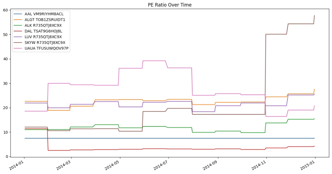
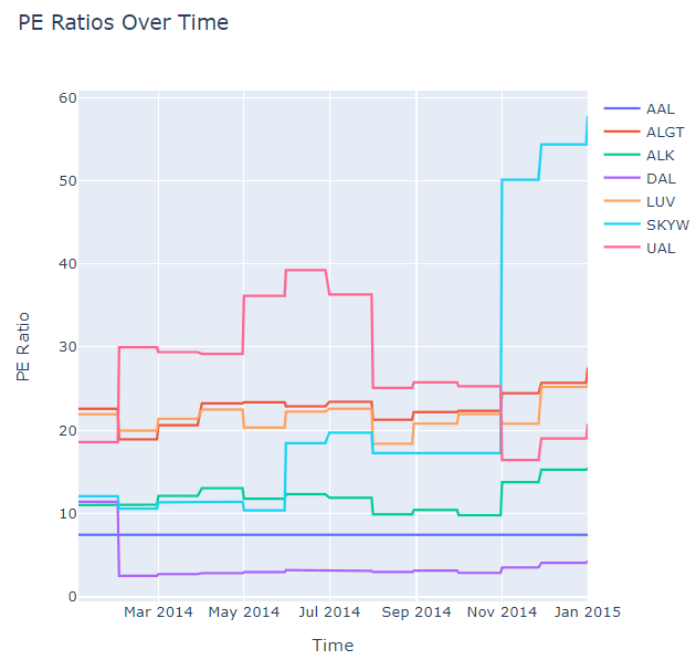
Plot Data
You need some historical Equity fundamental data to produce plots. You can use many of the supported plotting librariesPlot.NET package to visualize data in various formats. For example, you can plot line charts.
Follow these steps to plot line charts using built-in methodsPlotly.NET package:
- Get some historical data.
- Load the
Plotly.NETpackage. - Create
Lineobjects for eachSymbol. - Create a
Layout. - Combine the charts and assign the
Layoutto the chart. - Convert to pandas DataFrame.
- Call the
plotmethod on the history DataFrame. - Show the plot.
var history = history = qb.History<Fundamental>(symbols, new DateTime(2014, 1, 1), new DateTime(2015, 1, 1));
history = qb.history[Fundamental](symbols, datetime(2014, 1, 1), datetime(2015, 1, 1))
#r "nuget: Plotly.NET"
#r "nuget: Plotly.NET.Interactive"
using Plotly.NET;
using Plotly.NET.Interactive;
using Plotly.NET.LayoutObjects;
var charts = symbols.Select(
    symbol => Chart2D.Chart.Line<DateTime, decimal, string>(
        history.Select(x => (DateTime)x.Time),
        history.Select(x => (decimal)x[symbol].ValuationRatios.PERatio)),
        Name: symbol.Value
    )
);
LinearAxis xAxis = new LinearAxis();
xAxis.SetValue("title", "Time");
LinearAxis yAxis = new LinearAxis();
yAxis.SetValue("title", "PE Ratio");
Title title = Title.init("PE Ratios Over Time");

Layout layout = new Layout();
layout.SetValue("xaxis", xAxis);
layout.SetValue("yaxis", yAxis);
layout.SetValue("title", title);
var chart = Plotly.NET.Chart.Combine(charts);
chart.WithLayout(layout);
data = {}
for fundamental_dict in history: # Iterate trading days
    for symbol, fundamental in fundamental_dict.items(): # Iterate Symbols
        datum = data.get(symbol, dict())
        datum['index'] = datum.get('index', [])
        datum['index'].append(fundamental.end_time)
        datum['pe_ratio'] = datum.get('pe_ratio', [])
        datum['pe_ratio'].append(fundamental.valuation_ratios.pe_ratio)
        data[symbol] = datum

df = pd.DataFrame()
for symbol, datum in data.items():
    df_symbol = pd.DataFrame({symbol: pd.Series(datum['pe_ratio'], index=datum['index'])})
    df = pd.concat([df, df_symbol], axis=1)
df.plot(title='PE Ratio Over Time', figsize=(15, 8))
plt.show()
display(chart)
Line charts display the value of the property you selected in a time series.
Examples
The following examples demonstrate some common practices for applying the Equity Fundamental Data dataset.
Example 1: PE Ratio Line Chart
The following example studies the trend of PE Ratio of AAPL using a line chart.
// Load the required assembly files and data types in a separate cell.
#load "../Initialize.csx"
// Load the necessary assembly files.
#load "../QuantConnect.csx"
#r "nuget: Plotly.NET"
#r "nuget: Plotly.NET.Interactive"
using QuantConnect;
using QuantConnect.Data;
using QuantConnect.Data.Fundamental;
using QuantConnect.Algorithm;
using QuantConnect.Research;

using Plotly.NET;
using Plotly.NET.Interactive;
using Plotly.NET.LayoutObjects;

// Create a QuantBook.
var qb = new QuantBook();

// Request AAPL's fundamental historical data.
var equity = qb.AddEquity("AAPL");
var history = qb.History<Fundamental>(
    equity.Symbol,
    start: qb.Time - TimeSpan.FromDays(365),
    end: qb.Time,
    resolution: Resolution.Daily
);

// Select the PE Ratio to study.
var peRatios = history.Select(x => x.ValuationRatios.PERatio).ToList();
var time = history.Select(x => x.EndTime).ToList();

// Crete the Line Chart with the PE Ratios.
var chart = Chart2D.Chart.Line<DateTime, double, string>(
    time,
    peRatios
);
// Create a Layout as the plot settings.
LinearAxis xAxis = new LinearAxis();
xAxis.SetValue("title", "Time");
LinearAxis yAxis = new LinearAxis();
yAxis.SetValue("title", "PE Ratio");
Title title = Title.init($"PE Ratio by Time of {equity.Symbol}");

Layout layout = new Layout();
layout.SetValue("xaxis", xAxis);
layout.SetValue("yaxis", yAxis);
layout.SetValue("title", title);
// Assign the Layout to the chart.
chart.WithLayout(layout);

// Display the plot.
display(chart)
# Create a QuantBook
qb = QuantBook()
# Request AAPL's fundamental historical data.
equity = qb.add_equity("AAPL")
history = qb.history(
Fundamental,
equity.symbol,
start=qb.time - timedelta(days=365),
end=qb.time,
resolution=Resolution.DAILY,
flatten=True
)
# Select the PE Ratio to study.
pe_ratio = history.loc[equity.symbol].apply(lambda x: x.valuationratios.pe_ratio, axis=1)
# Plot the PE Ratio line chart.
pe_ratio.plot(title=f"PE Ratio by Time of {equity.symbol}", ylabel="PE Ratio")
You can also see our Videos. You can also get in touch with us via Discord.
Did you find this page helpful?