Charting
Matplotlib
Introduction
matplotlib is the most popular 2d-charting library for python. It allows you to easily create histograms, scatter plots, and various other charts. In addition, pandas is integrated with matplotlib, so you can seamlessly move between data manipulation and data visualization. This makes matplotlib great for quickly producing a chart to visualize your data.
Preparation
Import Libraries
To research with the Matplotlib library, import the libraries that you need.
# Import the matplotlib library for plots and settings.
import matplotlib.pyplot as plt
import mplfinance       # for candlestick
import numpy as np
from pandas.plotting import register_matplotlib_converters
register_matplotlib_converters()
Get Historical Data
Get some historical market data to produce the plots. For example, to get data for a bank sector ETF and some banking companies over 2021, run:
qb = QuantBook()
tickers = ["XLF",   # Financial Select Sector SPDR Fund
           "COF",   # Capital One Financial Corporation
           "GS",    # Goldman Sachs Group, Inc.
           "JPM",   # J P Morgan Chase & Co
           "WFC"]   # Wells Fargo & Company
symbols = [qb.add_equity(ticker, Resolution.DAILY).symbol for ticker in tickers]
history = qb.history(symbols, datetime(2021, 1, 1), datetime(2022, 1, 1))
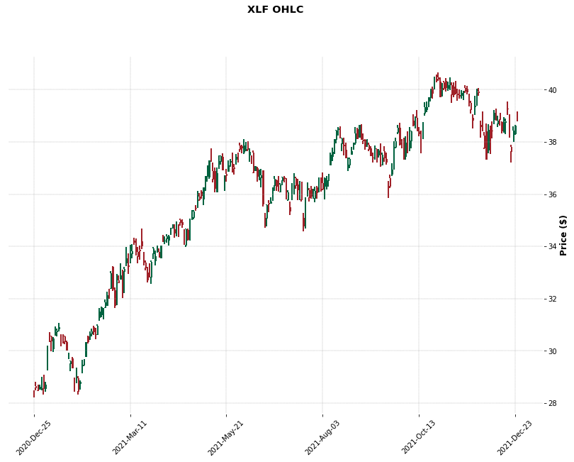
Create Candlestick Chart
You must import the plotting libraries and get some historical data to create candlestick charts.
In this example, we'll create a candlestick chart that shows the open, high, low, and close prices of one of the banking securities. Follow these steps to create the candlestick chart:
# Select a symbol to plot the candlestick plot.
symbol = symbols[0]

# Get the OHLCV data to plot.
data = history.loc[symbol]
data.columns = ['Close', 'High', 'Low', 'Open', 'Volume']

# Call the plot method with the data, chart type, style, title, y-axis label, and figure size to plot the candlesticks.
mplfinance.plot(data,
                type='candle',
                style='charles',
                title=f'{symbol.value} OHLC',
                ylabel='Price ($)',
                figratio=(15, 10))
The Jupyter Notebook displays the candlestick chart.
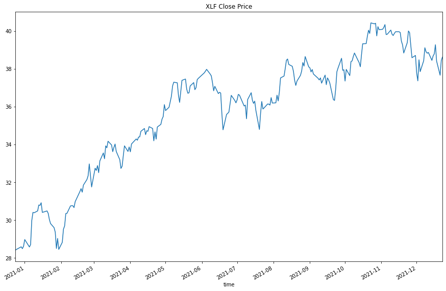
Create Line Plot
You must import the plotting libraries and get some historical data to create candlestick charts.
In this example, you create a line chart that shows the closing price for one of the banking securities. Follow these steps to create the line chart:
# Select a symbol to plot the candlestick plot.
symbol = symbols[0]

# Obtain the close price series of the symbol to plot.
data = history.loc[symbol]['close']

# Call the plot method with a title and figure size to plot the line chart.
data.plot(title=f"{symbol} Close Price", figsize=(15, 10))
The Jupyter Notebook displays the line plot.
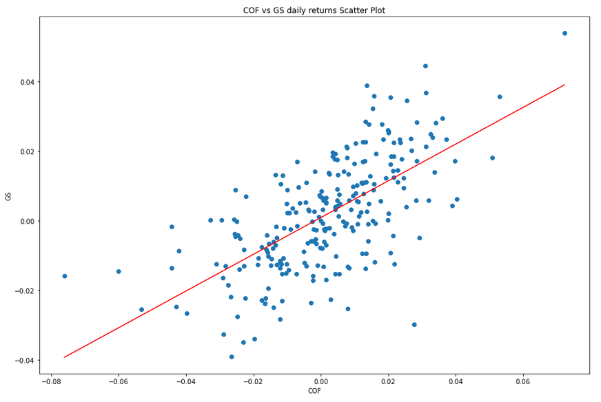
Create Scatter Plot
You must import the plotting libraries and get some historical data to create candlestick charts.
In this example, you create a scatter plot that shows the relationship between the daily returns of two banking securities. Follow these steps to create the scatter plot:
# Select 2 stocks to plot the correlation between their return series.
symbol1 = symbols[1]
symbol2 = symbols[2]
# Obtain the daily return series of the 2 stocks for plotting.
close_price1 = history.loc[symbol1]['close']
close_price2 = history.loc[symbol2]['close']
daily_returns1 = close_price1.pct_change().dropna()
daily_returns2 = close_price2.pct_change().dropna()

# Fit a linear regression model on the correlation.
m, b = np.polyfit(daily_returns1, daily_returns2, deg=1)
# This method call returns the slope and intercept of the ordinary least squares regression line.

# Generate a prediction line upon the linear regression model.
x = np.linspace(daily_returns1.min(), daily_returns1.max())
y = m*x + b

# Call the plot method with the coordinates and color of the regression line to plot the linear regression prediction line.
plt.plot(x, y, color='red')

# In the same cell, call the plot method, call the scatter method with the 2 daily return series to plot the scatter plot dots of the daily returns.
plt.scatter(daily_returns1, daily_returns2)

# In the same cell, call the title, xlabel, and ylabel methods with a title and axis labels to decorate the plot.
plt.title(f'{symbol1} vs {symbol2} daily returns Scatter Plot')
plt.xlabel(symbol1.value)
plt.ylabel(symbol2.value)
The Jupyter Notebook displays the scatter plot.
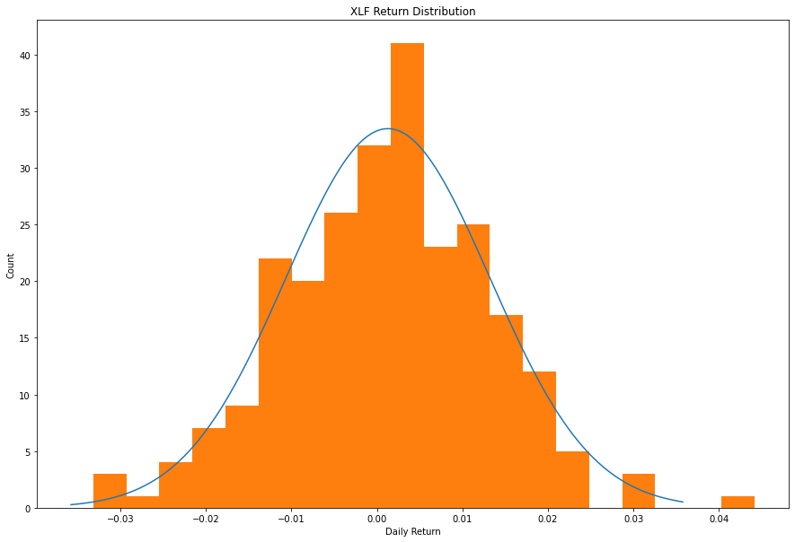
Create Histogram
You must import the plotting libraries and get some historical data to create candlestick charts.
In this example, you create a histogram that shows the distribution of the daily percent returns of the bank sector ETF. In addition to the bins in the histogram, you overlay a normal distribution curve for comparison. Follow these steps to create the histogram:
# Obtain the daily return series for a single symbol.
symbol = symbols[0]
close_prices = history.loc[symbol]['close']
daily_returns = close_prices.pct_change().dropna()

# Get the mean and standard deviation of the returns.
mean = daily_returns.mean()
std = daily_returns.std()
# Calculate the normal distribution PDF given the mean and SD.
x = np.linspace(-3*std, 3*std, 1000)
pdf = 1/(std * np.sqrt(2*np.pi)) * np.exp(-(x-mean)**2 / (2*std**2))

# Call the plot method with the data for the normal distribution curve.
plt.plot(x, pdf, label="Normal Distribution")
# In the same cell that you called the plot method, call the hist method with the daily return data and the number of bins to plot the histogram.
plt.hist(daily_returns, bins=20)
# In the same cell that you called the hist method, call the title, xlabel, and ylabel methods with a title and the axis labels to decorate the plot.
plt.title(f'{symbol} Return Distribution')
plt.xlabel('Daily Return')
plt.ylabel('Count')
The Jupyter Notebook displays the histogram.
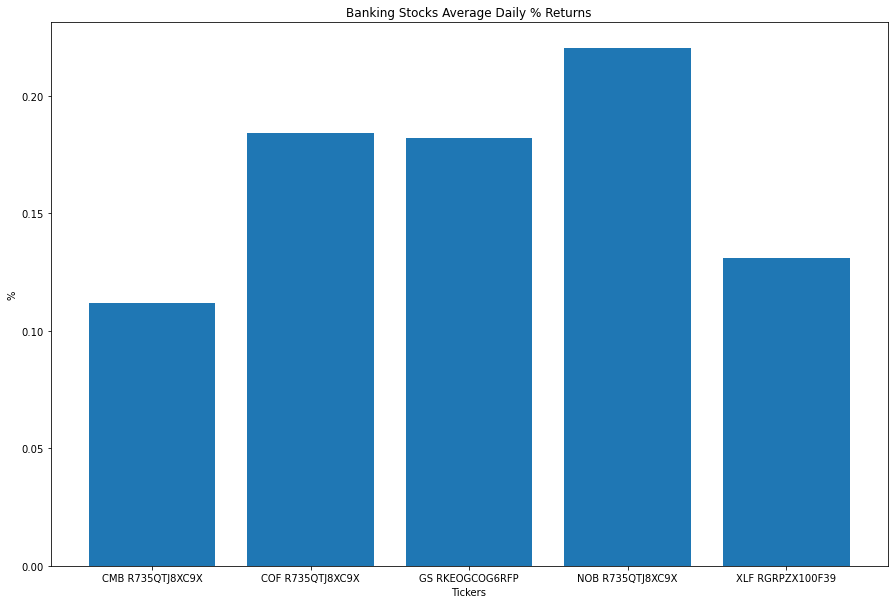
Create Bar Chart
You must import the plotting libraries and get some historical data to create candlestick charts.
In this example, you create a bar chart that shows the average daily percent return of the banking securities. Follow these steps to create the bar chart:
# Obtain the returns of all stocks to compare their return.
close_prices = history['close'].unstack(level=0)
daily_returns = close_prices.pct_change() * 100

# Obtain the mean of the daily return.
avg_daily_returns = daily_returns.mean()

# Create the figure to plot on with the size set.
plt.figure(figsize=(15, 10))

# Call the bar method with the x-axis and y-axis values to plot the mean returns as bar chart.
plt.bar(avg_daily_returns.index, avg_daily_returns)
# In the same cell that you called the bar method, call the title, xlabel, and ylabel methods with a title and the axis labels to decorate the plot.
plt.title('Banking Stocks Average Daily % Returns')
plt.xlabel('Tickers')
plt.ylabel('%')
The Jupyter Notebook displays the bar chart.
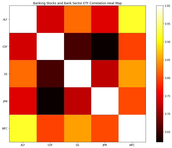
Create Heat Map
You must import the plotting libraries and get some historical data to create candlestick charts.
In this example, you create a heat map that shows the correlation between the daily returns of the banking securities. Follow these steps to create the heat map:
# Obtain the returns of all stocks to compare their return.
close_prices = history['close'].unstack(level=0)
daily_returns = close_prices.pct_change()

# Call the corr method to create the correlation matrix to plot.
corr_matrix = daily_returns.corr()

# Call the imshow method with the correlation matrix, a color map, and an interpolation method to plot the heatmap.
plt.imshow(corr_matrix, cmap='hot', interpolation='nearest')

# In the same cell that you called the imshow method, call the title, xticks, and yticks, methods with a title and the axis tick labels to decorate the plot.
plt.title('Banking Stocks and Bank Sector ETF Correlation Heat Map')
plt.xticks(np.arange(len(tickers)), labels=tickers)
plt.yticks(np.arange(len(tickers)), labels=tickers)

# Plot the color bar to the right of the heat map.
# In the same cell that you called the imshow method, call the colorbar method.
plt.colorbar()
The Jupyter Notebook displays the heat map.
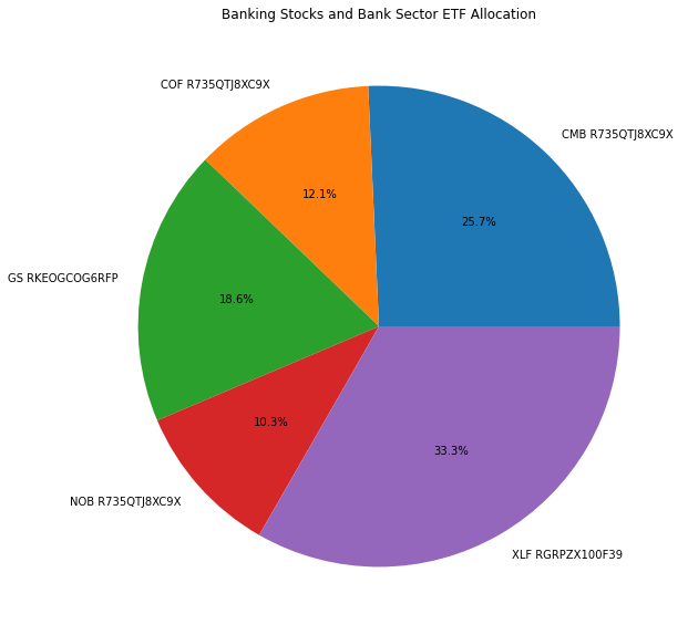
Create Pie Chart
You must import the plotting libraries and get some historical data to create candlestick charts.
In this example, you create a pie chart that shows the weights of the banking securities in a portfolio if you allocate to them based on their inverse volatility. Follow these steps to create the pie chart:
# Obtain the returns of all stocks to compare their return.
close_prices = history['close'].unstack(level=0)
daily_returns = close_prices.pct_change()

# Calculate the inverse of variances to plot with.
inverse_variance = 1 / daily_returns.var()

# Call the pie method with the inverse_variance Series, the plot labels, and a display format to plot the pie chart.
plt.pie(inverse_variance, labels=inverse_variance.index, autopct='%1.1f%%')
# In the cell that you called the pie method, call the title method with a title.
plt.title('Banking Stocks and Bank Sector ETF Allocation')
The Jupyter Notebook displays the pie chart.
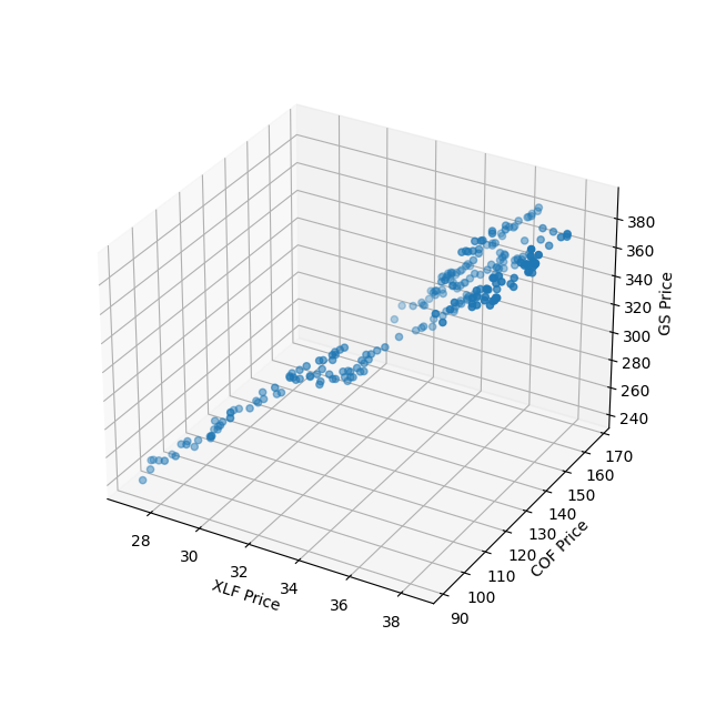
Create 3D Chart
You must import the plotting libraries and get some historical data to create candlestick charts.
In this example, you create a 3D chart that shows the price of an asset on each dimension, i.e. the price correlation of 3 different symbols. Follow these steps to create the 3D chart:
# Select the asset to plot on each dimension.
x, y, z = symbols[:3]

# Select the close price series of each symbol to plot with.
x_hist = history.loc[x].close
y_hist = history.loc[y].close
z_hist = history.loc[z].close

# Construct the basic 3D plot layout.
fig = plt.figure(figsize=(8, 8))
ax = fig.add_subplot(projection='3d')

# Call the ax.scatter method with the 3 price series to plot the 3D graph.
ax.scatter(x_hist, y_hist, z_hist)

# Update the x, y, and z axis labels.
ax.set_xlabel(f"{x} Price")
ax.set_ylabel(f"{y} Price")
ax.set_zlabel(f"{z} Price")

# Display the 3D chart. Note that you need to zoom the chart to avoid z-axis cut off.
ax.set_box_aspect(None, zoom=0.85)
plt.show()
The Jupyter Notebook displays the pie chart.
You can also see our Videos. You can also get in touch with us via Discord.
Did you find this page helpful?