Charting
Plotly
Preparation
Import Libraries
To research with the Plotly library, import the libraries that you need.
import plotly.express as px
import plotly.graph_objects as go
Get Historical Data
Get some historical market data to produce the plots. For example, to get data for a bank sector ETF and some banking companies over 2021, run:
qb = QuantBook()
tickers = ["XLF",   # Financial Select Sector SPDR Fund
           "COF",   # Capital One Financial Corporation
           "GS",    # Goldman Sachs Group, Inc.
           "JPM",   # J P Morgan Chase & Co
           "WFC"]   # Wells Fargo & Company
symbols = [qb.add_equity(ticker, Resolution.DAILY).symbol for ticker in tickers]
history = qb.history(symbols, datetime(2021, 1, 1), datetime(2022, 1, 1))
Create Candlestick Chart
You must import the plotting libraries and get some historical data to create candlestick charts.
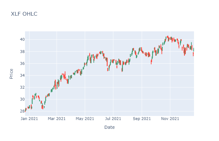
In this example, you create a candlestick chart that shows the open, high, low, and close prices of one of the banking securities. Follow these steps to create the candlestick chart:
# Select a symbol to plot the candlestick plot.
symbol = symbols[0]
# Get the OHLCV data of the symbol to plot.
data = history.loc[symbol]

# Call the Candlestick constructor with the time and open, high, low, and close price series to create the candlestick plot.
candlestick = go.Candlestick(x=data.index,
                             open=data['open'],
                             high=data['high'],
                             low=data['low'],
                             close=data['close'])

# Call the Layout constructor with a title and axes labels to set the plot layout.
layout = go.Layout(title=go.layout.Title(text=f'{symbol.value} OHLC'),
                   xaxis_title='Date',
                   yaxis_title='Price',
                   xaxis_rangeslider_visible=False)

# Call the Figure constructor with the candlestick and layout.
fig = go.Figure(data=[candlestick], layout=layout)

# Display the plot.
fig.show()
The Jupyter Notebook displays the candlestick chart.
Create Line Chart
You must import the plotting libraries and get some historical data to create candlestick charts.
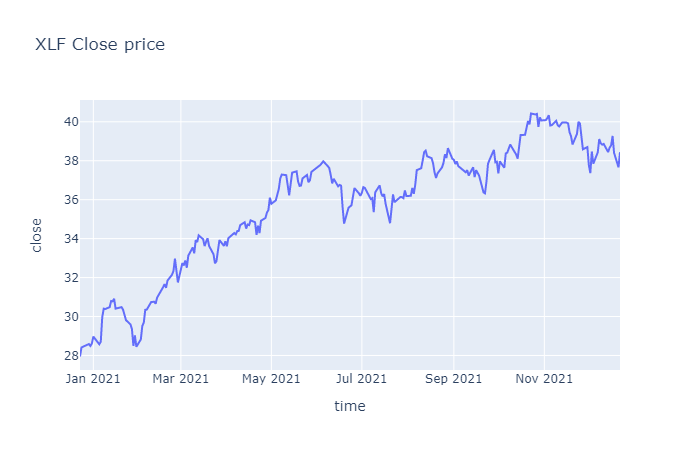
In this example, you create a line chart that shows the closing price for one of the banking securities. Follow these steps to create the line chart:
# Obtain the close price series for a single symbol.
symbol = symbols[0]
data = history.loc[symbol]['close']

# Call the DataFrame constructor with the data Series and then call the reset_index method to make the time column accessible to plotly.
data = pd.DataFrame(data).reset_index()

# Call the line method with data, the column names of the x- and y-axis in data, and the plot title to plot the close price series line chart.
fig = px.line(data, x='time', y='close', title=f'{symbol} Close price')

# Display the plot.
fig.show()
The Jupyter Notebook displays the line chart.
Create Scatter Plot
You must import the plotting libraries and get some historical data to create candlestick charts.
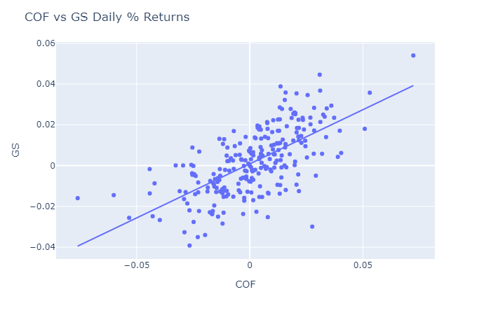
In this example, you create a scatter plot that shows the relationship between the daily returns of two banking securities. Follow these steps to create the scatter plot:
# Select 2 stocks to plot the correlation between their return series.
symbol1 = symbols[1]
symbol2 = symbols[2]
# Obtain the daily return series of the 2 stocks for plotting.
close_price1 = history.loc[symbol1]['close']
close_price2 = history.loc[symbol2]['close']
daily_returns1 = close_price1.pct_change().dropna()
daily_returns2 = close_price2.pct_change().dropna()

# Call the scatter method with the 2 return Series, the trendline option, and axes labels to plot the correlation into a scatter plot.
fig = px.scatter(x=daily_return1, y=daily_return2, trendline='ols',
                 labels={'x': symbol1.value, 'y': symbol2.value})

# Call the update_layout method with a title to update the plot title.
fig.update_layout(title=f'{symbol1.value} vs {symbol2.value} Daily % Returns')

# Display the plot.
fig.show()
The Jupyter Notebook displays the scatter plot.
Create Histogram
You must import the plotting libraries and get some historical data to create candlestick charts.
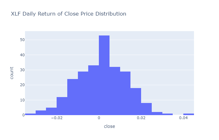
In this example, you create a histogram that shows the distribution of the daily percent returns of the bank sector ETF. Follow these steps to create the histogram:
# Obtain the daily return series for a single symbol.
symbol = symbols[0]
data = history.loc[symbol]['close']
daily_returns = data.pct_change().dropna()

# Call the DataFrame constructor with the data Series and then call the reset_index method.
daily_returns = pd.DataFrame(daily_returns).reset_index()

# Call the histogram method with the daily_returns DataFrame, the x-axis label, a title, and the number of bins to plot the histogram.
fig = px.histogram(daily_returns, x='close',
                   title=f'{symbol} Daily Return of Close Price Distribution',
                   nbins=20)

# Display the plot.
fig.show()
The Jupyter Notebook displays the histogram.
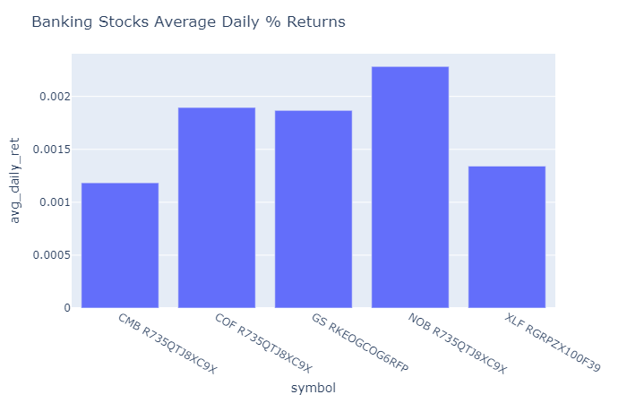
Create Bar Chart
You must import the plotting libraries and get some historical data to create candlestick charts.
In this example, you create a bar chart that shows the average daily percent return of the banking securities. Follow these steps to create the bar chart:
# Obtain the returns of all stocks to compare their return.
close_prices = history['close'].unstack(level=0)
daily_returns = close_prices.pct_change() * 100

# Obtain the mean of the daily return.
avg_daily_returns = daily_returns.mean()

# Call the DataFrame constructor with the avg_daily_returns Series and then call the reset_index method.
avg_daily_returns = pd.DataFrame(avg_daily_returns, columns=["avg_daily_ret"]).reset_index()

# Call the bar method with the avg_daily_returns and the axes column names to plot the bar chart.
fig = px.bar(avg_daily_returns, x='symbol', y='avg_daily_ret')
# Call the update_layout method with a title to decorate the plot.
fig.update_layout(title='Banking Stocks Average Daily % Returns')

# Display the plot.
fig.show()
The Jupyter Notebook displays the bar plot.
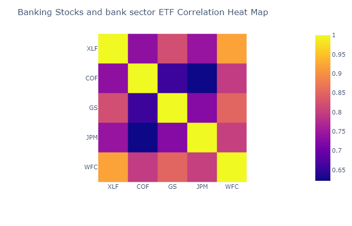
Create Heat Map
You must import the plotting libraries and get some historical data to create candlestick charts.
In this example, you create a heat map that shows the correlation between the daily returns of the banking securities. Follow these steps to create the heat map:
# Obtain the returns of all stocks to compare their return.
close_prices = history['close'].unstack(level=0)
daily_returns = close_prices.pct_change()

# Call the corr method to create the correlation matrix to plot.
corr_matrix = daily_returns.corr()

# Call the imshow method with the corr_matrix and the axes labels to plot the heatmap.
fig = px.imshow(corr_matrix, x=tickers, y=tickers)

# ICall the update_layout method with a title to decorate the plot.
fig.update_layout(title='Banking Stocks and bank sector ETF Correlation Heat Map')

# Display the plot.
fig.show()
The Jupyter Notebook displays the heat map.
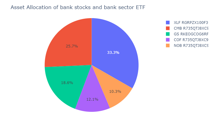
Create Pie Chart
You must import the plotting libraries and get some historical data to create candlestick charts.
In this example, you create a pie chart that shows the weights of the banking securities in a portfolio if you allocate to them based on their inverse volatility. Follow these steps to create the pie chart:
# Obtain the returns of all stocks to compare their return.
close_prices = history['close'].unstack(level=0)
daily_returns = close_prices.pct_change()

# Calculate the inverse of variances to plot with.
inverse_variance = 1 / daily_returns.var()

# Call the DataFrame constructor with the inverse_variance Series and then call the reset_index method.
inverse_variance = pd.DataFrame(inverse_variance, columns=["inverse variance"]).reset_index()

# Call the pie method with the inverse_variance DataFrame, the column name of the values, and the column name of the names to plot the pie chart.
fig = px.pie(inverse_variance, values='inverse variance', names='symbol')
# Call the update_layout method with a title to decorate the plot.
fig.update_layout(title='Asset Allocation of bank stocks and bank sector ETF')

# Display the plot.
fig.show()
The Jupyter Notebook displays the pie chart.
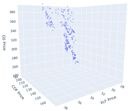
Create 3D Chart
You must import the plotting libraries and get some historical data to create candlestick charts.
In this example, you create a 3D chart that shows the price of an asset on each dimension. Follow these steps to create the 3D chart:
# Select the asset to plot on each dimension.
x, y, z = symbols[:3]

# Call the Scatter3d constructor with the data for the x, y, and z axes to create the 3D scatter plot.
scatter = go.Scatter3d(
    x=history.loc[x].close,
    y=history.loc[y].close,
    z=history.loc[z].close,
    mode='markers',
    marker=dict(
        size=2,
        opacity=0.8
    )
)

# Call the Layout constructor with the axes titles and chart dimensions to create the layout of the plot.
layout = go.Layout(
    scene=dict(
        xaxis_title=f'{x.value} Price',
        yaxis_title=f'{y.value} Price',
        zaxis_title=f'{z.value} Price'
    ),
    width=700,
    height=700
)

# Call the Figure constructor with the scatter and layout variables to plot them.
fig = go.Figure(scatter, layout)

# Display the 3D chart.
fig.show()
The Jupyter Notebook displays the 3D chart.
You can also see our Videos. You can also get in touch with us via Discord.
Did you find this page helpful?